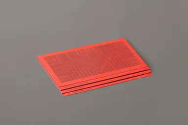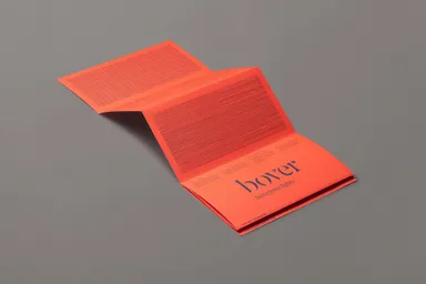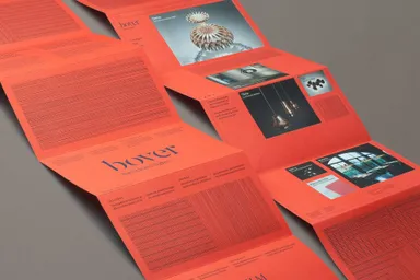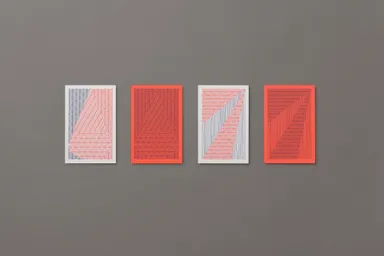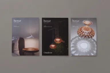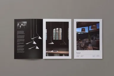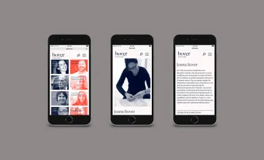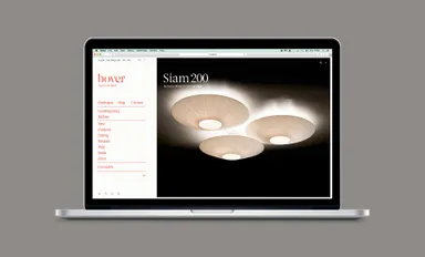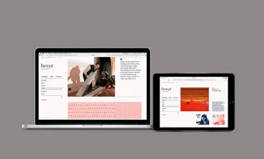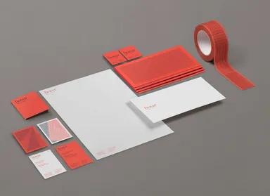
Drawing inspiration from Bover’s respect for traditional craftsmanship, the visual language uses their weave patterns, symbolizing artisan creativity and meticulous attention to detail.
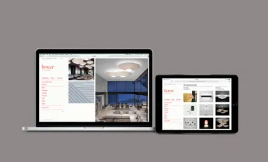
The website’s editorial criteria were also revised, with an emphasis on refined art direction and a defined SEO strategy to enhance Bover’s online presence. The result is a consistent identity that truly defines Bover.