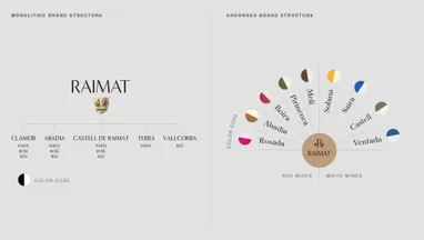
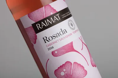
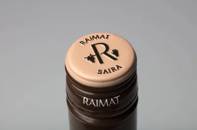
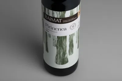
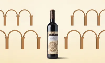
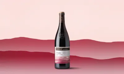
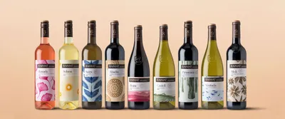
Logo Logo
  • Work
  • Strategy
  • Sharing
  • About
  • Shop
  • Contact
  • Work
  • Strategy
  • Sharing
  • About
  • Shop
  • Contact

Raimat

Stories with a bouquet

Industry

  • Food & Beverages

Services

  • Packaging

Context

Raïmat is a wine-growing business with more than 100 years of history behind it. They have always believed in innovation: beginning by turning a desert into vineyards to grow grapes and today, by being completely organic and committed to sustainability.

Why Mucho?

A brand leader like Raïmat demands the highest standards when it comes to graphic design. Their ambitions also require a worldwide team to help them reach the global market. Raïmat wasn’t looking for specialisation in the wine industry. Above all, what they wanted was the ability to bring a new approach and create something different.

Brief and objectives

1. Paradigm Shift

Nowadays, at the point of purchase wine buyers give greater value to the design than the brand itself. Traditionally, wine houses have been monoliths: they offer a range of wines, all with different names but all with identical branding. We decided it was important to address this product conservatism. Now, the personality of each wine has taken centre stage and the brand has an extra added layer: rankings. The packaging was radically changed which gave us more space to use. We filled it with creativity and content that was designed to work in harmony with the rest of the collection.

2. Ratings

Raïmat’s ad agency came up with the idea of introducing a ranking system for the intensity of the wine to help people who aren’t wine buffs make the right wine selection. At the same time, this change mustn’t alienate their more knowledgeable customers. The rating needed to be clear, elegant, and easy to understand: basically as visual as possible.

3. Awareness

Society is more and more aware about the products they consume and Raïmat is committed to only bringing to the market organic and environmentally sustainable products. Getting this across visually on the packaging was another essential aspect of the brief.

Workshop, hierarchy and story

Together, in a workshop with the client and their advertising agency, we came up with the information hierarchy as well as a moodboard which visually defined the brand’s values.
The ad agency, Usted, visited the vineyards, took in their environment, and sampled the wines which lead to them creating a name and story for each wine. Being lighter and fresher, the white wines are inspired by the air whereas the reds and roses are associated with the land. These names were influenced by local stories and legends which also helped to explain the history of the estate and its lands.

Idea / Concept

A wraparound label makes more of an impact but, to be feasible in terms of time and production costs, some technical issues had to be resolved. The new approach allowed us to get rid of the duplicated information that used to appear on both the back and front labels. The end result is a single label with a more modern look. Not having two labels anymore means that the graphic solution has to involve the whole bottle. We created a collection of wines that have a literary look to them. Our basic concept was that there was a story for each wine and that stories, like wines, are years in the making.

Illustrations

Since each wine has its own story they should all have their own graphic element to convey the spirit of the wine in a visual and poetic way. This feature has been worked into different patterns which run around the bottle. Each wine has its own distinct personality so in order to respect these differences we worked with three different illustrators, María Corte, Carla Cascales and Judit Maldonado.

Color

The intensity of each wine corresponds to a color code so that the bottles are easy to recognise when lined up alongside one another. The color range is brighter and more primary for the less intense wines whereas the more intense ones use more subdued and complex colors.
To reflect their commitment to only producing organic and sustainable wines we changed the classic Raïmat black to two browns with different intensities. Textured paper and matt printed bottle foils add to the natural look. This approach avoided having to fake a craft paper look or add a finish that mimics texture.

Information hierarchy

A bar with an upper and lower section carries all the wine’s information. It stands out from the background and the text appears in a clear and ordered fashion. The foil is also used to display the wine’s intensity rating. All the information that needs to be transmitted is therefore presented in a coherent order and system.

Iconography

To help people choose their wine a number of specially designed icons appear on the bottle’s back. These explain the wine’s other characteristics such as body, taste and food pairings.

Typography

In a redesign it is often helpful to keep some elements from before to serve as a visual link to the past. We did this with the brand logo which we made smaller and now appears in negative form. In order that these alterations didn’t have any effect on its impact we thickened the letters. On a typographic level we decided to use two clearly distinct typefaces. A serif with more organic strokes and a neutral sans serif for the information.

Symbol

The word Raïmat comes from grape (raïm) and hand (mà) as can be seen in the coat of arms found on a castle in the region. This shield is used for the top of range packaging but it isn’t a brand symbol because the date that appears in it, 1627, marks the start of the name, Raïmat, not of the vineyard. To avoid this confusion it was decided to update the brand symbol and join the hand and the grape with the R of Raïmat. This allows the symbol to be used in small spaces such as the top of the foil.

Finishes

We opted for labels which were as least treated as possible and had the feel of “paper”. They were printed with 5 direct inks featuring two foil stampings and an embossing. Varnishes were avoided in accordance with their commitment to sustainability and environmentalism.

Related projects

199

Artesa Vineyards & Winery Born in Barcelona, raised in Napa Valley

228

Laboratorio Raimat A proud Lab

236

Natural wines by Pepe Raventós Flavour of inherent nature

Natural wines by Pepe Raventós Flavour of inherent nature

Natural wines by Pepe Raventós Flavour of inherent nature

We look forward to hearing from you. For new business, please contact the closest office directly. For general enquiries, please email us: info@wearemucho.com
San Francisco

+1 415 546 1399
sanfrancisco@wearemucho.com

466 Geary Street, Suite 500
San Francisco, CA 94102

Melbourne

+61 414 867 860
melbourne@wearemucho.com

Office 3, Level 2
358 Lonsdale Street
Melbourne VIC 3000

Barcelona

+34 93 481 40 89
barcelona@wearemucho.com

Morales, 27K
08029 Barcelona

Paris

+33 (0)1 73 71 58 20
paris@wearemucho.com

80 rue Taitbout
Square d’Orléans
75009 Paris

Copyright © 2023
  • Terms
Subscribe
Logo