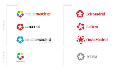
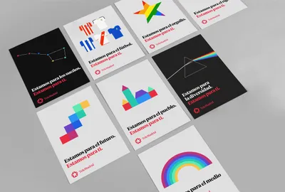
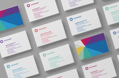
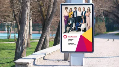
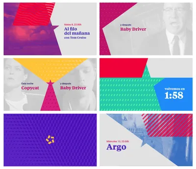
Value
Meaning
Future
Designed
Work Media

Telemadrid

Embarking on a significant branding project, TeleMadrid partnered with Mucho and Comodo Screen to redefine its image. The goal was to revitalize the brand, placing the people of Madrid at its heart, while maintaining its iconic symbol—the star.

Industry
Media

The Challenge

TeleMadrid, a recognized symbol of Madrid’s community, faced a critical decision point: whether to evolve or revolutionize its brand. The challenge was to reposition TeleMadrid as the go-to reference for everyone in Madrid, reclaiming and effectively communicating values like openness, community focus, collaboration, interactivity, and co-creation. Furthermore, this transformation needed to work seamlessly across a multimedia network, necessitating a flexible and digital visual language.

The Strategy

The strategy hinged on retaining and developing the star, an iconic element from the Community of Madrid’s flag, connecting it directly with the people of Madrid. The goal was to place the star—and thus the citizens—at the center of the visual language. We aimed to bring forth distinct personalities for the three brands within the group, each symbolizing different characteristics while sharing the common star.

01b TM Antes Despues

The Solution

Each brand was given its unique symbol, working perfectly as on-screen watermark logos. 

The color usage was revised for more variety, and the logo consolidated to ‘TeleMadrid’ with a capitalized ‘M’. The Tiempos typography, designed for newspapers, was used to reflect TeleMadrid’s journalistic values. 

A vibrant, simple system was developed using polygons, flat colors, and animations, creating a virtually limitless yet easily recognizable language. This complete rebranding, paired with a resonant tagline and distinctive audio-branding, puts the real stars of TeleMadrid—the people of Madrid—at the center.

12 TM coche1
11 TM Bolsa
16 LO On Air
10 TM On Air