Value
Meaning
Future
Designed
Work Hospitality
Caldea building

Caldea

The Flow of the Good Life

Caldea is one of Andorra’s major brands, a reference in Southern Europe for democratising the SPA experience, and a successful business leading the transformation of Andorra’s tourism and economy. In this context of evolution, Caldea has entrusted the team of Mucho + Usted to carry out an ambitious brand renewal, through a new visual identity and a brand strategy that supports an ambitious investment and growth plan.

The Challenge

Despite its success, Caldea faced strategic branding challenges, including:

  1. - The need for a more powerful and expressive brand, capable of communicating beyond campaigns and adapting to diverse audiences and contexts.
  2. - A new brand that reflects the essence of the new Andorra, moving away from perceptions solely associated with ski and shopping tourism.
  3. - Updating Caldea’s visual expression to resonate with new generations and compete in a constantly evolving market.
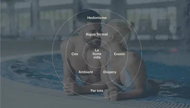
  4. - The expansion of Caldea’s offerings had created complexity in the customer experience, with multiple sub-brands and services that made brand coherence difficult.
  5. - A more digital and dynamic brand, adapted to a digital world, allowing for a seamlessly omnichannel experience.
  6. - Becoming an aspirational brand for everyone, maintaining its accessibility while enhancing its appeal to more demanding audiences.
CALDEA valors2

The Strategy

Caldea’s strategy to address these challenges was structured on several fronts:

  1. - Position Caldea as a lifestyle brand, symbolizing the new Andorra and a healthier, more active, and conscious way of life, aimed at both millennials and Generation Z.
  2. - Provide Caldea (for the first time) with a brand purpose that transcends the product and connects with all its stakeholders: “Inspire the best version of Andorra and make it accessible to everyone through unforgettable moments of good living.”
  3. - Simplify the customer experience through a clearer brand architecture and a reduction of sub-brands and name types, prioritizing the parent brand, CALDEA.
  4. - Elevate the brand with more sophisticated artistic direction and a more resourceful brand behavior, without losing its democratic and Andorran essence.
  5. - Reconnect with two key audiences: Andorrans and new residents, positioning Caldea as a social and sports reference in the country.
  6. - Equip the brand with more assets and resources to expand its versatility and communication capacity across a variety of channels, especially on social media.

The Solution

The solution to Caldea’s rebranding project includes a comprehensive overhaul to create a dynamic and adaptable brand identity. This features a new 360-degree symbol, a modern typeface, a versatile color palette and dynamic visual language. The sophisticated art direction and relatable tone of voice aim to inspire unforgettable experiences, reinforcing Caldea’s leadership in wellness.

The new symbol, representing a 360-degree service and experience, embodies both dynamism and relaxation. Its circular form reflects the promise of an all-encompassing experience, from invigorating activities to serene moments. The wave at the bottom symbolizes the fluidity and adaptability of Caldea’s wellness offerings, ensuring a seamless experience tailored to each visitor’s needs. This symbol guarantees that at Caldea, the good life is lived in motion, renewing energies and stimulating the senses, completing the wellness circle that defines us.

Caldea Logo adjusted rev

The logo, with its distinctive identity and customized typeface, serves as a proud emblem of the brand. The immediate recognition of the logo across all applications is crucial for forging a unified and recognizable brand. Consistency in its use is vital, prominently featuring in all corporate materials and communications.

We collaborated closely with Facundo Capece to craft the sound design for CALDEA’s Audiologo. Our goal was to blend organic, acoustic elements with synthetic sounds. This dynamic interaction was crafted to synchronize seamlessly with animations, featuring a piano motif akin to irregular water droplets. The composition unfolds with a subtle buildup leading to a reverberant final note.

From this audiologo, we developed the full track. It begins with the piano’s rhythmic drips, gradually integrating deeper frequency rhythms. A progression of chords enhances a relaxed yet nuanced atmosphere, each chord flowing naturally into the next.

Synthetic layers and digitally treated granular pianos add textured depth, subtly enriching the background. The introduction of bass, gradually shapes the rhythm, culminating in a gentle crescendo—a moment of pause before returning to the Audiologo.

The undulating lines are a signature graphic element in Caldea’s brand identity. Flowing gracefully across the page, these lines evoke the natural fluidity and serene calm that define Caldea. They add a sense of movement and continuity across all media, from printed materials to digital interfaces. By varying the amplitude and frequency, these lines adapt flexibly to different spaces and contexts, ensuring a clean aesthetic and visual coherence that perfectly aligns with Caldea’s ethos.

Caldea Subway

The color palette is anchored by two primary tones: Caldea Dia, an elegant off-white, and Caldea Nit, a sophisticated slate gray. These colors represent the dual nature of Caldea’s offerings. Caldea Dia reflects vibrant daytime activities in the Thermoludic space and Caldea Nit is reserved for the elegance of nighttime events and exclusive hotel and spa packages. The secondary color palette complements and enriches the primary colors, adding visual versatility and enhancing brand communication. This modern and adaptable color selection allows the brand to connect with various audiences and initiatives, maximizing impact and appeal.

Caldea Type

The rebranding also introduces a new typeface, Graphik, which is simple, versatile, and modern. This typeface combines rounded forms with grotesque architecture, perfect for maintaining clarity and readability. 

CALDEA billboard 4

The new art direction is more sophisticated, focusing on capturing high-quality, authentic moments that align with Caldea’s brand values: the good life, thermal water, escape, body, ambiance, design, hedonism, and inclusivity. The photography style emphasizes the dual nature of Caldea’s offerings, from the tranquility of thermal waters and massages to the energy of shows and activities. This approach showcases the rich experiences that rejuvenate both body and spirit.


CALDEA business card 01
CALDEA soap closeup
CALDEA Towell
CALDEA uniform 03
CALDEA Menu desayuno2
CALDEA Coasters closeup1

Caldea’s tone of voice is designed to be close, accessible, and relatable, reflecting a brand that is easy-going, fun, and attentive. The communication is structured, clear, and concise, always aiming to connect with the audience on a personal level. By adopting this comprehensive and strategic rebranding approach, Caldea aims to inspire the best version of Andorra and make it accessible to everyone through unforgettable moments of good living, solidifying its position as a leader in the wellness industry.

CALDEA phone closeup
Caldea Newsletter CAT2
CALDEA Ipad web
23 10 CAL Front desk

Project Credits