CD PROJEKT RED reveals its refreshed logo at gamescom 2026, co-created with Mucho
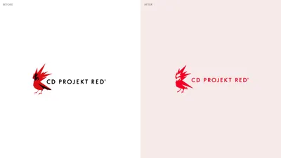
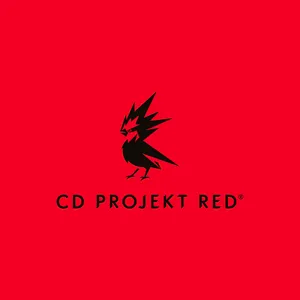
A new chapter for CD PROJEKT RED’s visual identity begins, with a refined iconic symbol designed to carry its identity forward.
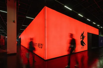
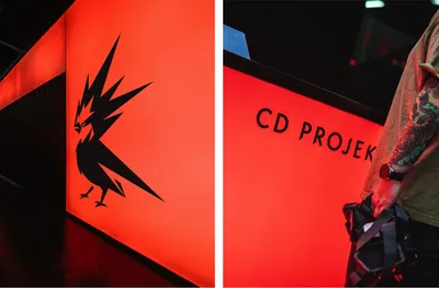
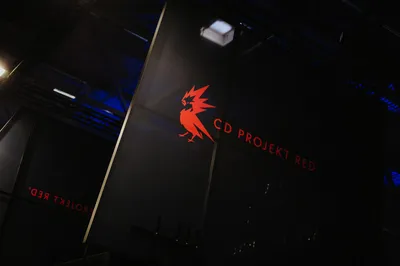
CD PROJEKT RED revealed its refreshed logo at gamescom 2026, the world’s biggest event for computer and video games.
Together with the CD PROJEKT RED team, we’ve refined the existing identity, preserving its essence while giving it new wings through a simpler and stronger presence. The refreshed visual identity centres on a distinctive red, simplified shapes and a refined symbol with a more impactful expression. Together, these elements bring greater clarity to the logo while preserving its recognisable character.
We’re proud to see the refreshed logo revealed at gamescom 2026, bringing the work to the gaming community and marking the beginning of this new chapter for the brand.
Full case study coming soon.