The Power of a Tiny Accent (and the strategy behind it)
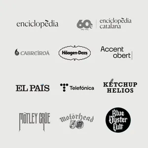
The legendary publisher, Enciclopèdia Catalana is celebrating its 60th anniversary.
The commemorative logo of Enciclopèdia Catalana features a bold, wide-open accent, just like the one we introduced during their rebranding back in 2018 at Mucho. Back then, the biggest decision wasn’t about color, typeface, or even a symbol. It was the è.
That open accent wasn’t just a matter of spelling. It was the heart of the brand. A minimal graphic gesture, yet big and powerful enough to say it all: the Encyclopedia is Catalan (notably, Spanish uses only closed accents (as we call them) and has no open accents), while quietly affirming its strong commitment to language and knowledge rigor. In fact, the power of that Catalan accent was so strong, it made it possible to drop “Catalana” from the wordmark altogether. The accent said it all.
One word is always better than two. That open è is a doorway. It locates you. It connects you. It has direction. It has character. It doesn’t shout, but it stands out. Like everything that matters. Sometimes, all it takes is an accent.
In that same spirit, Fundació.cat has now a new name: Accent Obert. And this shift signifies their repositioning from solely managing the .cat domain, to actively supporting and driving the digital life in Catalan, across regions and platforms. And what’s the most powerful way to express the singularity of the language other than through one of its most distinctive marks? That very same open accent, the open accent è. A distinctive mark in Catalan, French, Italian and other languages, yet one that doesn’t even exist in Spanish.
Accents aren’t just phonetics. They are identities. And brands know it.
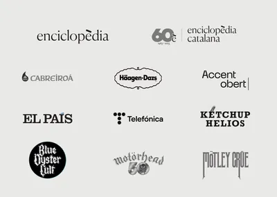
Let’s take a closer look at Helios, a long-standing Spanish brand renowned for its jams and sauces. Recently, Helios launched a playful campaign inviting people to write “kétchup” with an accent to emphasize that, while the recipe is American, the product itself is proudly Spanish. In the campaign videos, Helio´s employees “apologize” in a humorous fashion for not having added the accent earlier, (even though the accented “kétchup” is missing from their website).
Another example is Cabreiroá, a Spanish natural mineral water brand from Galicia. In July 2025, the brand launched a playful, feel-good campaign titled “Con tilde en la Á”: a subtle reference to its proud Galician roots, expressed through humor and distinctive typography.
Telefónica, in its 2021 rebrand, reinstated the bold accent on the ‘ó’ after years of typographic debate. Some interpreted the use of the old ‘f’ ligature (that is, the joining of two or more letters into a single symbol), as a subtle substitute for the missing accent.
Similarly, El País has successfully turned the accent (í) on its brand name into a symbol of editorial rigor and personality, by highlighting it in its logo and embracing it throughout its campaigns.
These aren’t gestures of nostalgia. They are intentional strategies of tone: How to sound. Who to be. And that’s exactly what strategy means in branding.
Sometimes, accents break free from language and become a pure symbol. Häagen‑Dazs, for example, used the Nordic umlauts to evoke Europeness, craftsmanship, and communicate a sense of premiumness. This unorthodox use of diacritical marks has helped build an entire brand identity, and all from a tiny, invented sign.
Other notorious examples, this time drawing from rock music, include bands like Mötley Crüe, Motörhead, or Blue Öyster Cult which like Häagen‑Dazs have embraced the metal umlaut. Phonetic nonsense, visual power, attitude. The accent establishes the brand as a shield, a stance, a myth.
Accents, tildes, marks. They don’t just shift pronunciation. They shift perception. A tiny sign can become the voice of a brand. A noise that carries tone and truth.
Because sometimes, a single tiny accent can tell the entire story.