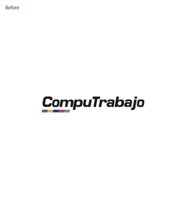
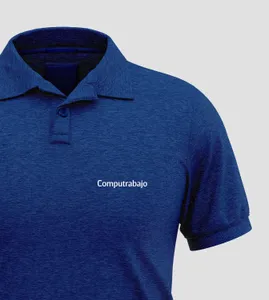
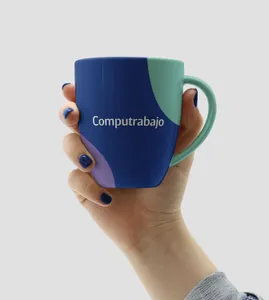
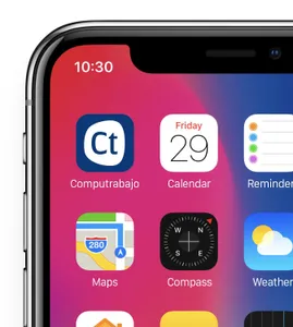
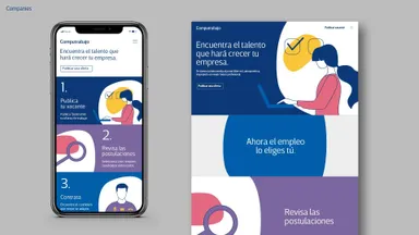
To modernize the brand, a redesign focused on the logo’s typographic aspect was necessary. The new design involved using a thin, sans font with varied thin and thick lines to bring a fresher and more personal tone to the brand. The capital letter ‘C’ of Computrabajo was reimagined to generate a simple, compact, and distinctive visual identity. This change allowed for a more united visual language, capable of containing candidate profile photos, accompanying messages, and reinforcing the brand.
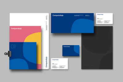
The name was adjusted by changing the ‘T’ to lowercase, generating a new concept in Latin American vocabulary and effectively transforming “Computrabajo” into a brand in itself. The chosen color palette used dark blue to communicate confidence and trust, with a secondary palette of more cheerful colors to capture the attention of candidates. A more professional tone was used for companies.
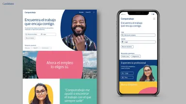
Complementing the visual identity, a new narrative was crafted with a friendly and warm tone of voice. This strategy resonates with the brand’s core values - inspiring, optimistic, confident, friendly, and empowering. It demonstrates that Computrabajo is a brand that remains close to its users, especially in uncertain times, such as when looking for a new job.
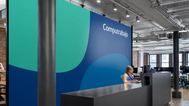
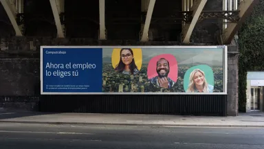
Furthermore, the brand experience was expanded beyond the digital world. Computrabajo was brought to the city streets, where people commute to work, to raise awareness of the brand’s purpose and identity. The communication channels and key messages for both candidates and companies were brought closer together to create a more unified brand experience.
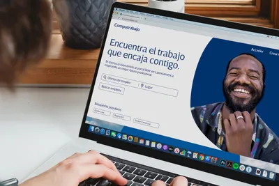
Lastly, the brand’s warm and human touch was expressed in photography and art direction. Casual pictures of people were used instead of the typical professional photographic style, showing people in a more holistic and human way. This design solution helped Computrabajo sustain and boost its leading position in Latin America.