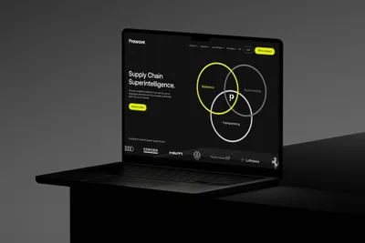
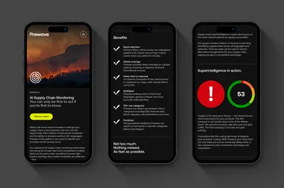
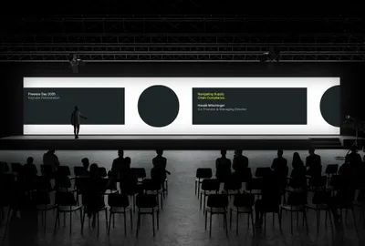
The core of the new brand identity is expressed in a bold visual language and wordmark. The new wordmark takes the meaning of ‘Pre’ (before) and expresses it through a simple and clever typographic device that combines the first letter, ‘P’, and an exclamation mark — a universal sign for alertness.
This new letterform represents Prewave’s superintelligence and ability to foresee risks. The dash and dot that creates the exclamation mark can then be extended into a visual language that represents supply chains themselves — in all their complexity.
We also equipped Prewave with new verbal guidelines, helping them express their purpose to the world with impact and influence. Photographic art direction was also considered, grounding their mission in the real world, emphasising their vast overview of global supply chains.