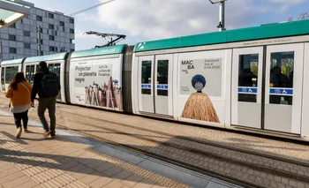
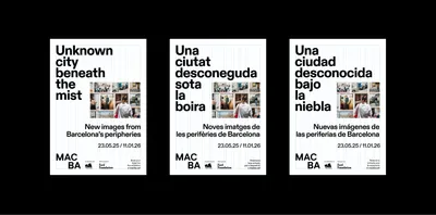
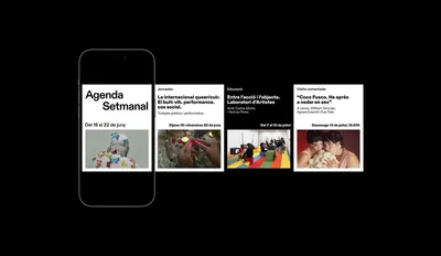
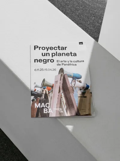
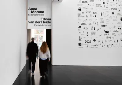
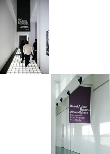
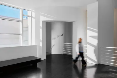
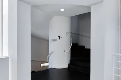
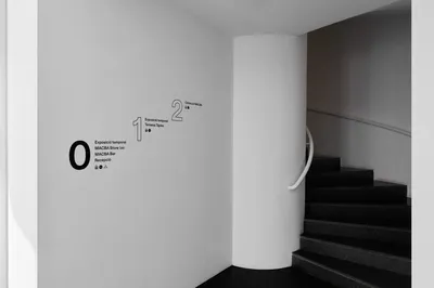
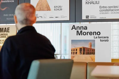
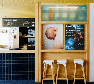
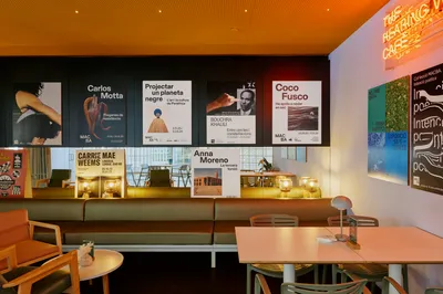
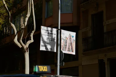
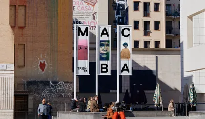
Our response was to build the identity around openness. Starting from the idea of The Possible Museum, we developed a system that feels more accessible, permeable and alive, creating a framework clear enough to unify the museum while allowing each programme and exhibition to express its own voice.
The updated logo breaks out of the black box, becoming more prominent and flexible across applications. No longer confined, it can be split into MAC and BA, creating a space to play with images, text, and new meanings. The typographic compositions follow the same logic, moving away from a fixed centre and behaving in a more open and dynamic way. Built on a modular grid, with ABC Diatype and a restrained black-and-white palette, the new system introduces variation, without losing focus on the work.