1
2
3
4
5
6
7
8
9
10
11
12
13
14
15
16
17
18
Value
Meaning
Future
Designed
Work Lighting

Protopixel

Reimagining light as a medium for creation

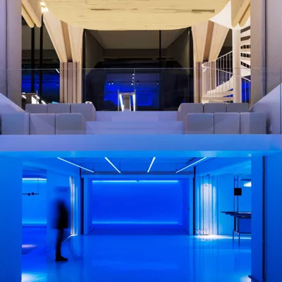
Protopixel is a pioneering creative tech company, sought to redefine how light is perceived and used. Our mission was clear: to demonstrate how Protopixel builds the best tools for the best creators, enhancing and impacting each dimension of space in the process.

The Challenge

Working alongside the Protopixel team, we noticed that traditional lighting systems often prioritize function over feeling, limiting creativity and expression. One thing was clear to us: Protopixel is not here to control creators but to empower them, not by building systems to control but tools to build outcomes. The challenge: the new brand aims to liberate light from rigid frameworks, transforming it into an intuitive, expressive, and accessible tool for creators.

The Strategy

Balancing the brand’s technical credibility with its creative journey was not a compromise—it was Protopixel’s competitive edge. A bold narrative was crafted to shift the conversation from “Controlling light” to “Creating with light”, ensuring that Protopixel is seen as an enabler, not a system.

The Solution

The brand stands for what they build. The light beyond control is a compelling narrative challenging conventional perceptions of light. A shift from technical lighting control solutions to a universal tool for creators. A warm, inviting, and modern design that reflects the essence of the brand. Protopixel now stands as a trailblazer in lighting technology, allowing architects, designers, integrators, and tech innovators to craft extraordinary experiences through light.

3 1 Protopixel Avatar App 3
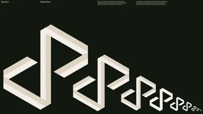
6 Proto Symbol
6 2 Apple Watch
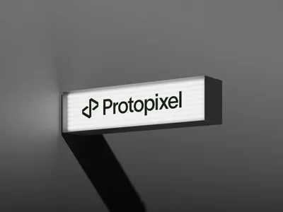
5 Protopixel Lightbox
7 Typography Static 3

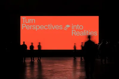
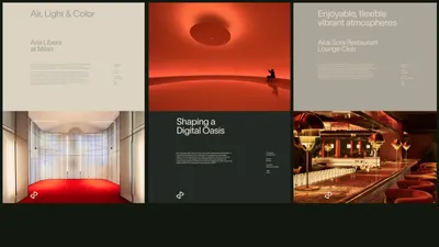
We set out to build a visual language that would be creatively brave across every brand expression (bold, expressive, and unafraid to stand out) while embracing captivating beauty across every touchpoint: from the website and product interface to live experiences at stands and conferences. This duality reflects Protopixel’s core: a powerful creative tool made for light, but also designed to inspire. The result is a brand identity that not only communicates with clarity, but evokes emotion and wonder through every interaction.

12 1 Billboard 1
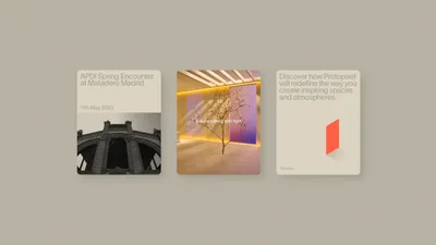
Protopixel Poster Mockup
12 3 Conferencia v1
10 Posters Projects v3

The iconography evolves alongside the creative journey—from simple, functional UI icons to rich, expressive visuals. Starting with clear symbols for navigation, it progresses through System Architecture and Build Icons, which add complexity and visual depth. At the highest level, Space Layers become almost illustrative, prioritizing expression over utility. This layered approach mirrors how users move from structure to creativity in designing with light.

14 Proto Icon Set
15 Atmospheres Interacions

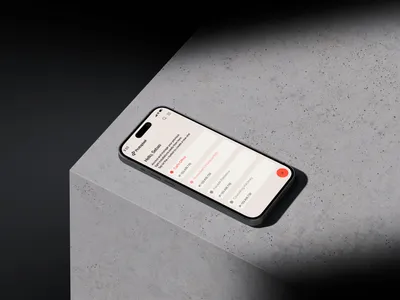
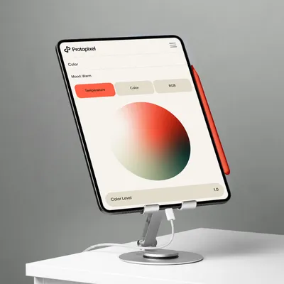
The new website embodies a sleek, modern look that reflects the brand’s commitment to innovation and simplicity. Its clean layout, generous white space, and smooth navigation make exploring the site both intuitive and enjoyable. Designed to engage without overwhelming, the user experience feels natural and effortless—an elegant digital space that communicates clarity, creativity, and confidence.

Proto Iphone 14 Pro copia
19 Proto I Pad
Proto App UI
19 Proto Iphone
22 Proto Social Media Layout