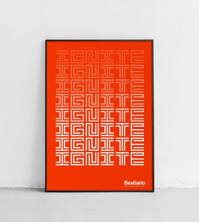
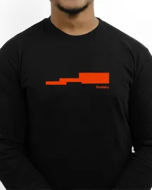
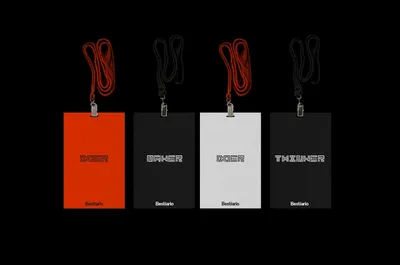
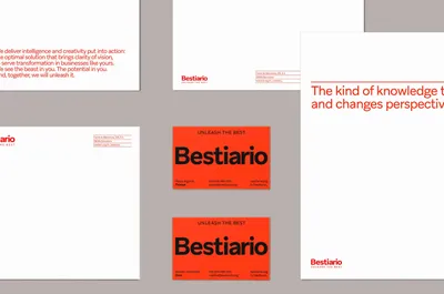
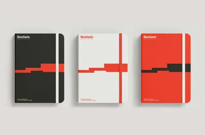
A visual identity based on the labyrinth
We used the concept of a labyrinth to visually represent perception; each time different, in each project moving towards a new solution in a complex environment as that of data.
The different ways in which a labyrinth is formed is useful to explain the different ways in which Bestiario is capable of seeing the potential of every project as well as the potential in different kinds of solutions through data logic and lateral thinking. Through a modular system, we also developed a unique typography, manifesting the digital environment which the company dominates. In addition, we proposed a system of icons developed from this same grid.
Defining the brand elements
The brand’s identity is based on using the labyrinth in either its complete or partial forms, like a pattern. To define the visual elements first the Aribau Grotesk typography was chosen as it is linked with more rational thinking and humanistic character of the brand.
Then for the company colors we chose an orange with two neutral colours, gray and black. The orange color is energetic and positive, as well as stimulating and dynamic. The colour represents that which we use as a guide to signal or emphasise on something important. We’ve also added a set of secondary colours that is used only on corporate and internal digital documents.