Beyond external stakeholders, engaging our internal audience was a critical aspect of our strategy. We conducted tailored sessions with key departments within Aeroméxico to deepen their understanding and enthusiasm for the new purpose, ensuring its organic and cohesive adoption throughout the company.
Aeroméxico: Visual Language
An identity to reach further
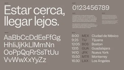
We knew we had to evolution the brand itself, so we did a new visual identity and designed assets tailored to propel the brand into a more digital-centric future. Also we made a comprehensive set of guidelines to spearhead the industry with consistency and clarity.
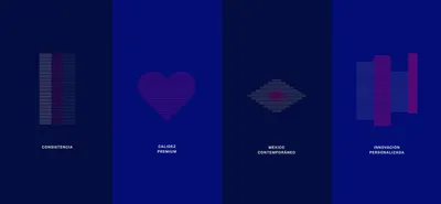
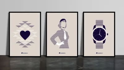
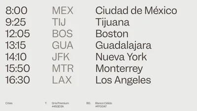
Our visual language draws inspiration from the logotype’s stripes, conveying a sense of consistency through horizontal rhythmic repetition.
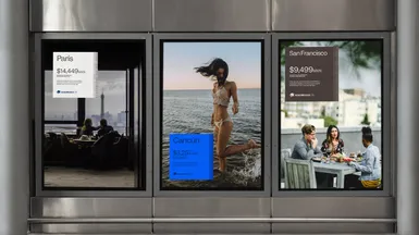
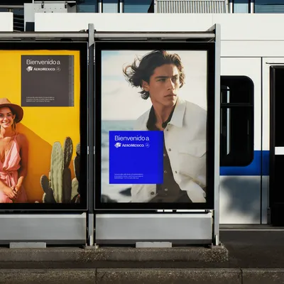
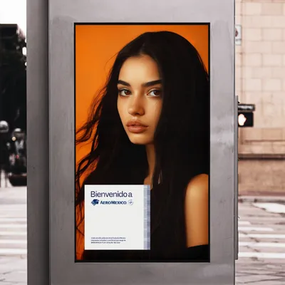
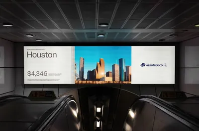
A modern airline brand is synonymous with continuous travel experiences. We’ve developed a graphic system to deliver messages with warmth and premium quality.
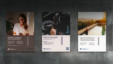
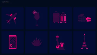
A larger brand needs to expand its efforts and reach further. The brand’s visual language includes a transition into a comprehensive illustration style.
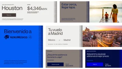
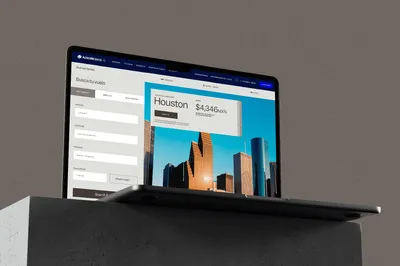
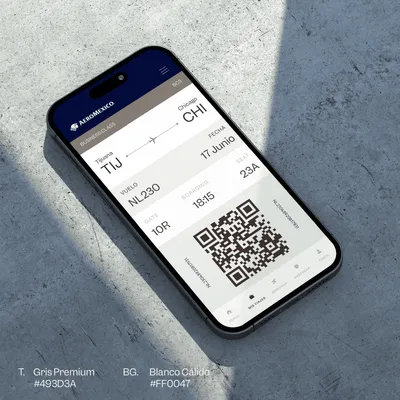
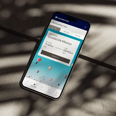
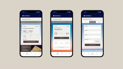
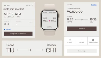
All the elements of the brand behavior combine to produce a seamless experience throughout the customer journey.
At Mucho Brand Design Agency, we’re passionate about bringing your ideas to life with designs that truly connect and inspire. Let’s work together to turn your vision into a brand story that not only stands out but also resonates deeply with your audience.
