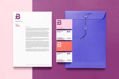
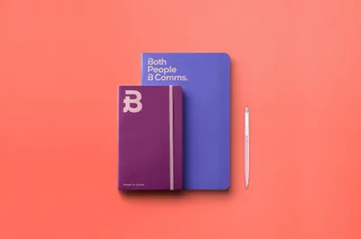
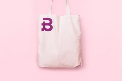
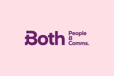
Built around the concept of connection, the ampersand was leveraged to create a distinctive logotype, embodying the brand’s visual language across applications. This symbol serves to bridge dual concepts, reflecting the company’s core values: humanity & technology, inclusivity & hybridity, disruption & empathy, thought & action.
Both
Both is a Barcelona-based corporate communication agency specializing in people, culture, and innovation. Its services encompass PR, consultancy, solutions, content creation, and event productions. Recognizing the critical link between internal and external communication in humanizing organizations, Both required a fresh brand expression.
Industry
Corporate Services
The result was a new naming and comprehensive identity that encapsulated experience, strategy, and emotion. This was further reinforced by representing conceptual ambivalences through juxtaposed images, which together, created a compelling visual narrative.