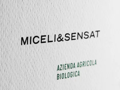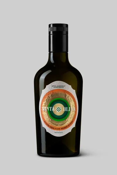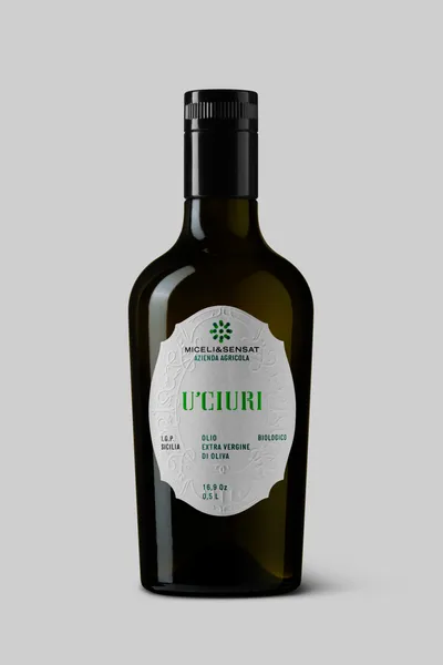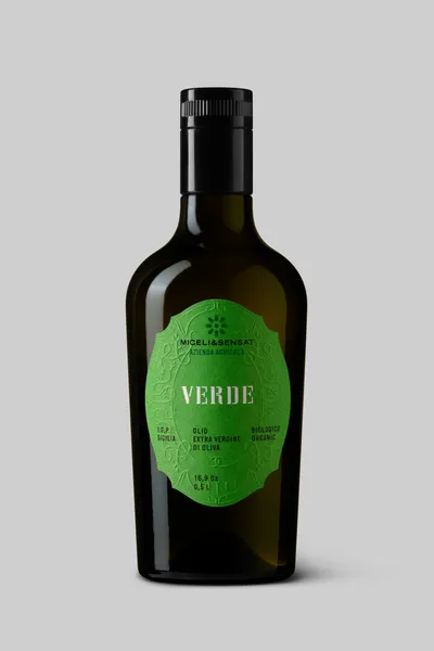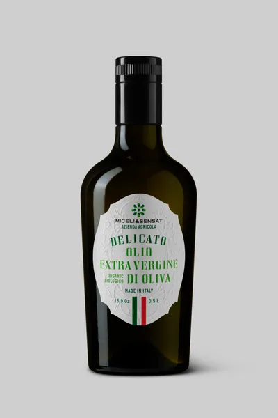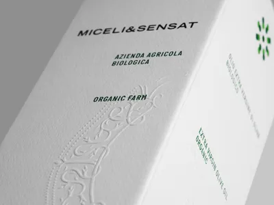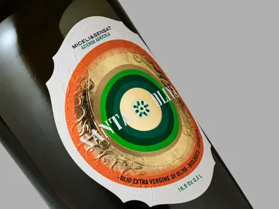
The visual identity of Paolo Miceli and Sergio Sensat’s olive oil brand continues to evolve in collaboration with Mucho, blending contemporary clarity with vernacular tradition. At the heart of the design is the now-iconic symbol: two overlapping squares composed of green dots, representing the merging of two distinct cultures into a shared vision. Depending on the oil, the motif shifts—sometimes radiant, sometimes quiet—but always echoing the sun-soaked Sicilian groves from which the oils are born.
Typography remains an essential part of the brand’s voice: the custom headline font, inspired by local stencils, sits alongside Italian Plate N1, a subtle nod to mid-century car plates, bringing a modern edge grounded in heritage.
This thoughtful design language lays the foundation for the 2024–2025 product launches—each new addition offering a different tone, texture, and personality to the growing collection.