Value
Meaning
Future
Designed
Work Banking

Piraeus

Founded in 1916 and publicly listed on the Athens Stock Exchange, Piraeus is Greece’s leading banking institution, serving 6 million customers and employing 7,700 staff members. In collaboration with their agency, The Newtons Laboratory, Piraeus engaged Mucho for a strategic rebrand following a remarkable recovery that revitalized both the bank and the country’s economy. As CEO Mr. Megalou noted, “After the recovery of the economy, the sector, and the bank itself, it is now time to move forward.” This rebrand is his commitment to the future.

The Challenge

The Strategic Rebranding of Piraeus

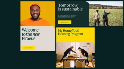
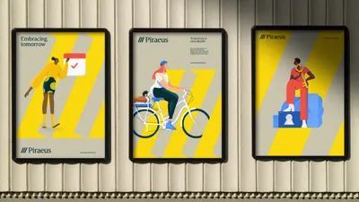
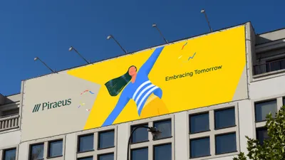
The rebranding initiative, underscored by brand purpose “Embracing the future,” was driven by the need to assert the bank’s transformation and readiness to embark on a new era. Mr. Megalou identified a crucial gap: “The bank’s evolution has not been effectively communicated to our employees, partners, customers, and society at large.” This effort illustrates the strategic impact of rebranding under visionary leadership. The repositioning aimed to:

  • - Establish Piraeus as a universally accessible, inclusive, and socially engaged bank.
  • - Offer seamless, flexible, and efficient banking solutions.
  • - Build an empathetic brand that genuinely cares.
  • - Act as a proactive consultant and life advisor to customers.
  • - Pioneer environmental sustainability in Greece.
  • - Lead unprecedented social and economic transformations with a bold, reliable brand.
  • - Create a meritocratic, engaging workplace.

The overarching challenge, as articulated by the marketing team and the CEO, was to “reaffirm the bank’s leadership role and set a trajectory for future success, underpinned by digital transformation and sustainable development (ESG).”

The Strategy

The strategy was to introduce a bolder, distinctive, and future-ready visual identity that extends beyond traditional banking and is deeply rooted in the brand’s purpose. This involved:

  • - Clearly articulating the bank’s evolution through a refreshed brand expression and behavior that highlights Piraeus’ role in modernizing the Greek economy and impacting society.
  • - Maintaining a connection to the brand’s heritage to preserve trust while adopting a modern, forward-looking brand identity.

From bank to brand

Despite high brand recognition, Piraeus made strategic changes to enhance its brand strength:

  • - Transitioning from “Piraeus Bank” to simply “Piraeus” to reflect a broader vision beyond banking, embracing a future-oriented mission.
  • - Standardizing the logo in English to ensure brand consistency.

Brand architecture

The rebrand included a significant simplification of the brand architecture to enhance customer experience and reflect a modern, omnichannel approach:

  • - Consolidation of product, service, and internal brands under fewer sub-brands focused on key segments: Personal and Private Banking, with a separate identity for the Foundation.
  • - Elimination of the Winbank brand, integrating its values of agility, modernity, and convenience into the main Piraeus brand, establishing Piraeus as the sole digital banking solution within the group.

The result is a more consistent yet versatile brand, allowing the company to impact stakeholders and sectors beyond the traditional ones.

Symbol of change


The reimagined symbol in Piraeus’ rebranding transforms the three stripes to honor heritage and embrace a bold future, symbolizing Progress, Innovation, Reliability, and Openness. The custom logotype enhances visibility and underscores a modern approach.

1 Piraeus Logotype
2 Piraeus Case Study Materiales
3 Piraeus Symbol Iphone

Sonic Branding: Crafting a musical identity

The new audio logo, created with Banjo Landscapes, reflects Piraeus’ values of closeness and humanity through tones of acoustic instruments like the piano and celesta. Its memorable rhythm, based on the Greek tribrach meter, aligns with the visual symbol’s three bars and the syllables in “Piraeus.” This ascending scale enhances the brand with a positive, open, and distinctive sonic identity.

“Our partnership with Mucho has been stimulating in revitalizing our corporate identity. Their unparalleled expertise and their unique inventive approach were central to reimagining the Piraeus brand. Our new corporate identity reflects our forward-looking aspirations, our openness to society, and our commitment to shaping a future where employees, customers, and stakeholders prosper together.”
Christos Megalou - CEO at Piraeus

A vibrant palette for a forward-thinking brand

Green is the new Blue in our updated palette, which transitions from Yellow and Corporate Blue to a vibrant combination of Piraeus Yellow, Green, and Grey. The brighter Piraeus Yellow embodies the bank’s spirit, Green symbolizes sustainability and growth, and Grey provides balance. This new palette offers flexibility across various platforms, reflecting a forward-thinking mindset.

7 Piraeus IPHONE MOCKUP 021

Introducing Piraeus Open: A typeface for tomorrow

Piraeus Open is a bespoke typeface created in collaboration with Jordi Embodas. Available in two styles, Serif and Sans, it offers four weights and features 578 characters, enhancing the brand’s clarity and versatility. Designed for digital-first applications, Piraeus Open supports 56 languages. The Serif style conveys trust and serenity, while the Sans style offers readability and Mediterranean charm, making it ideal for digital interfaces.

8 1 Piraeus IPHONE MOCKUP 26
Piraeus Omega handle
“Working with Mucho was a sweet balance between a global, future-ready, branding approach & a warm, empathetic understating of our needs. They managed to encapsulate our brand values into a fresh, vivid, & innovative visual language.”
Loukas Petrounias - CMO at Piraeus

New direction in illustration

Working together with Xoana Herrera, we developed a suite of illustrations using bright, simple shapes to convey a human and approachable touch. These illustrations are integral to making the brand more relatable and accessible, supporting Piraeus’ mission to genuinely connect with customers and the broader community.

16 Piraeus Illustrations
Piraeus Illustration Mockup Scalators
Piraeus Illustration Hand

Tailored communications: Connecting Piraeus with diverse customer segments

The rebranded communications strategy of Piraeus is designed to resonate across diverse customer segments, from Individual Banking to Personal and Private Banking. Each segment receives a customized communication approach, flexible enough for both digital and print touchpoints, ensuring a seamless experience across all channels. This approach reflects the specialized services and premium experiences that Piraeus offers. The goal of these communications is not just to inform but to forge a deep connection with each customer, ensuring they feel both valued and understood.

22 Piraeus 3 posters

Two distinct tiers shape our communication strategy

Tier 1 communicates the bank’s core values with the reimagined symbol as a powerful emblem, establishing a strong customer connection. Tier 2 introduces a modular speech bubble graphic, enhancing engagement by introducing products and services in a conversational way. Together, these tiers ensure a dynamic, clear, and consistent communication strategy that adapts to customer needs.

13 Piraeus Case Study Materiales

Unified digital experience: Piraeus integrates Winbank

The elimination of the Winbank brand integrates its values of agility, modernity, and convenience into the main Piraeus brand, establishing Piraeus as the sole digital banking solution within the group. This seamless integration enhances the digital touchpoints, including the website and app, providing a unified and streamlined experience. Customers can now enjoy the innovative features and user-friendly design of the Piraeus app and website, ensuring a consistent and cohesive digital banking journey.

21 Piraeus Ipad
Piraeus App
Piraeus Branch Facade Rev
25 Piraeus poster sustainability
15 Piraeus Annual Report
27 Piraeus conference
24 Piraeus 3 Posters illustration
19 Piraeus OOH
20 Piraeus OOH

Project credits

We believe this rebranding for Piraeus not only elevates the bank’s market presence but also sets a new benchmark for financial institutions in Greece and beyond.

At Mucho Brand Design Agency, we’re passionate about bringing your ideas to life with designs that truly connect and inspire. Let’s work together to turn your vision into a brand story that not only stands out but also resonates deeply with your audience.

Let’s work together