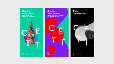
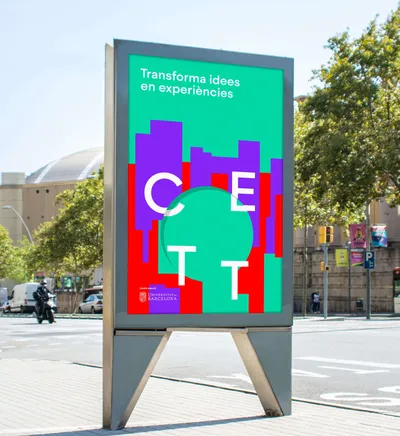
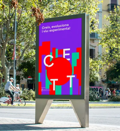
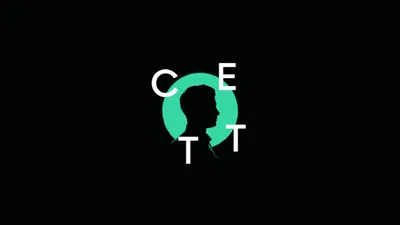
Logo Logo
  • Work
  • Strategy
  • Sharing
  • About
  • Shop
  • Contact
  • Work
  • Strategy
  • Sharing
  • About
  • Shop
  • Contact

CETT

From a staple of tourism to the leader of experiences

Industry

  • Education

Services

  • Brand Identity
  • Digital
  • Motion
  • Signage
  • Strategy

The economy of experiences

While around 80% of millennials choose to spend money on a desirable experience over something material, the trend extends beyond young people to every age bracket and socioeconomic class. The demand for experiences has encouraged businesses to think differently, to design and promote an offering to satisfy that need. The education sector is not the exception, having responded to this trend creating a variety of degrees tailored to this market.

CETT is the Tourism, Hospitality and Gastronomy leading university in Barcelona and has been so since 1969. After 50 years of growth and evolution, it naturally reached a turning point. The need to transform their brand strategy and identity became apparent; it needed to evolve and adapt to their current vision of higher education, to their broad academic offering, to the new generation of students and to today’s digital environment.

Amongst its closest competitors CETT stands out for many reasons. They are the only centre to fully embrace the economy of experiences, offering in turn the widest range of fields of study. All their degrees and certification courses are at the very centre of this trend: Tourism, Hospitality and Gastronomy. So, it was clear that the narrative at the core of their new identity needed to focus on experiences.

Taking ownership of experiences to transform a tourism university

It is through experiences that we connect with the world and with others, that we live. The aesthetic experiences that all three —Tourism, Hospitality and Gastronomy— provoke is what binds these areas together. The word experience in itself bears resemblance to the educational richness, growth and transformation that a student has exposure to during their time at CETT, both personally and professionally.

“Through experiences” is, therefore, the tagline of the brand and sits at the core of the brand narrative and identity. When accompanied by verbs, the tagline becomes a living organism that supports the key messages of the brand: Grow through experiences, connect through experiences, learn through experiences, open minds through experiences, are but a few examples of these.

The logo as the key to the brand visual language

The circle is the main element of the new brand identity. It represents the transformation of the student into a professional, but it also represents an open look, a new perspective.

The circle is used both as a container, either with pictures or textures inside, or as a graphic element. The latter shifts the focus to the surrounding content, becoming the circle a more explicit representation of the brand logo.

The circle —with its pictures, textures and variable positions for letters— highlights the importance of values like flexibility, dynamism and adaptability, which are a fundamental part of the culture at CETT.

A bright, impactful, moving brand

The rich palette of the brand represents life and the abstract world of senses, delivering a vivid visual experience. The differentiation between the programmes employs a unique set of three colours and textures, designed as graphic resources, that also support a variety of corporate communication.

This versatility facilitates the adaptation of the brand to all sorts of environments, particularly digital ones. It is the digital-native generation that is now experiencing CETT. Their world is one of textures, movement, and sound; and so, to fit in and be embraced the brand needed to behave accordingly.

Bringing the brand closer to every audience

Clarity of the brand and its realms was key from the start. We created three sub-brands to clearly explain all the activities at the centre. “CETT Corporate” for all the services related to consultancy, awards and collaborations with enterprises, “CETT Alumni” to represent all the community who have studied at the centre, and “CETT Foundation” to show the social activity the centre carries out with grants, social actions and research efforts.

Roll-out

Nearly as exciting as the development of the brand itself is the creation of the assets that will carry the brand beyond, to the outside world. The façade signage is the first of many, like the entrance totem, the hall lift walls, classroom backgrounds, and student materials, uniforms or merchandising. And, of course, taking advantage of the moving brand and its impactful stance, we designed a variety of online touchpoints: the website, online brochures, the newsletter template, motion elements for its YouTube channel and a landing page promoting the rebranding, brand.cett.cat

For this project, Mucho teamed up with Gimmewings for motion graphics, and Llos for programming the landing page.

Related projects

130

SHIFTA Rethinking the school of the future

173

UC Annual Report 2018 Collaborate & Innovate

254

UOC A responsive shield for an online university brand

We look forward to hearing from you. For new business, please contact the closest office directly. For general enquiries, please email us: info@wearemucho.com
San Francisco

+1 415 546 1399
sanfrancisco@wearemucho.com

466 Geary Street, Suite 500
San Francisco, CA 94102

Melbourne

+61 414 867 860
melbourne@wearemucho.com

Office 3, Level 2
358 Lonsdale Street
Melbourne VIC 3000

Barcelona

+34 93 481 40 89
barcelona@wearemucho.com

Morales, 27K
08029 Barcelona

Paris

+33 (0)1 73 71 58 20
paris@wearemucho.com

80 rue Taitbout
Square d’Orléans
75009 Paris

Copyright © 2023
  • Terms
Subscribe
Logo