The Challenge
Overmoon aims to become the go-to vacation rental for family vacations. It needed an identity that could stand out from other vacation rental sites, and that also reflected the joy of a family vacation.
Mucho uses own technical and analysis cookies which process connection and/or device data together with browsing habits to facilitate browsing and analyse website usage statistics. Obtain further information.
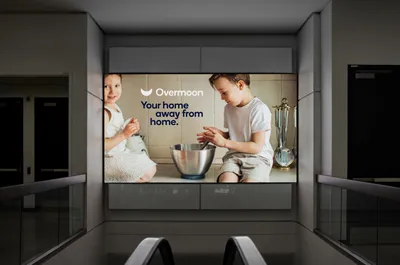
Overmoon is a start-up offering a growing collection of family-oriented vacation rentals, owned and run by them. This means every Overmoon getaway has all the comforts of home, with the joy (and reliability) of your favorite hotel.
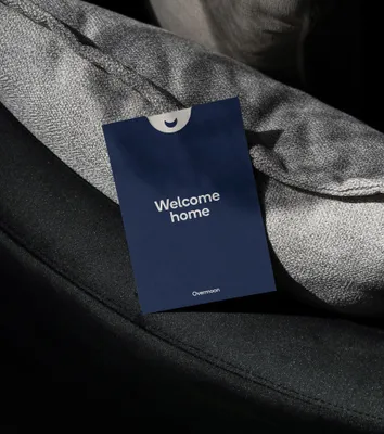
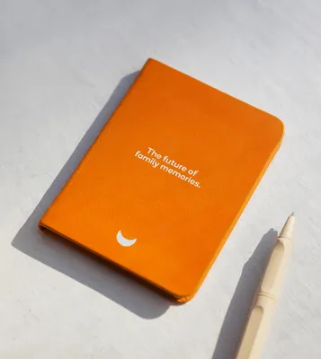
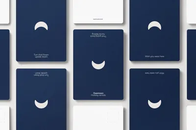
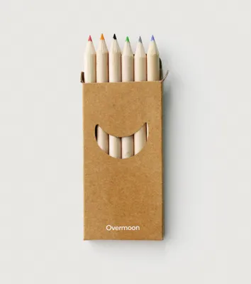
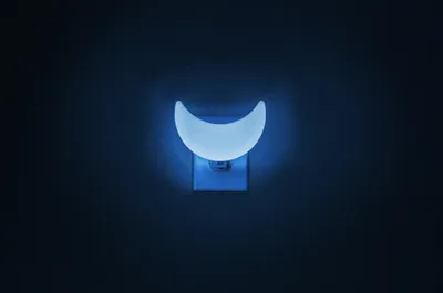
The name Overmoon, created with A Hundred Monkeys, is inspired by the informal British phase ‘over the moon’. The symbol is a crescent moon flipped over to become a smile, hinting at the joys of a stay with Overmoon.
Overmoon aims to become the go-to vacation rental for family vacations. It needed an identity that could stand out from other vacation rental sites, and that also reflected the joy of a family vacation.
We first needed to understand the pain points of family vacations with kids, and anyone you could call family. Travelling with young kids is a daunting task for many parents, as they often have specific products they need for their child. Overmoon’s business was centered around catering to those specific needs of families.
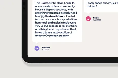
Core to that is developing trust with guests, and communicating the magic of a vacation where everything is catered to you. We knew the key to bringing a family-centric vacation rental startup would be a visual language that elicits an emotional response of what an Overmoon experience can be like for guests.
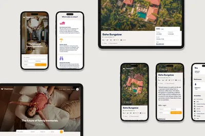
Understanding the pain points of family vacations with kids, and anyone you could call family, Mucho developed an identity that’s personable, trustworthy, and family oriente, based around the joy of a vacation made easy.
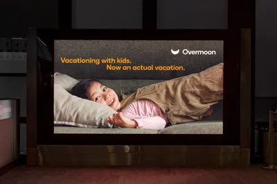
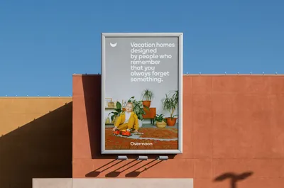
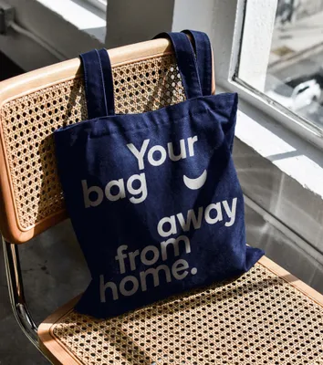
The headlines have a bit of cheekiness, and have a slight twist that brings a smile to make every interaction with the brand enjoyable.
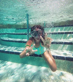
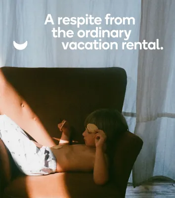
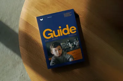
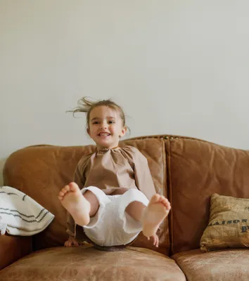
Abeautiful, ‘DIY’ photography style shows photos that emulate the ones families already take of each other, and capture the special, everyday moments families actually experience together. A homemade photography style steered away from the industry standard, stereotypical stock photography of families on vacation.
All the elements come together to form a visual identity made to appeal to young families looking to go on a truly stress-free vacation, and sets Overmoon apart from the competition.
