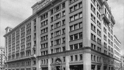
The brand narrative draws from the hotel’s rich origins, deeply connected with its neighborhood and the city of Barcelona. Conceived by Francesc Cambó, a prominent figure engaged with local culture and social development, the hotel embodies his dedication and love for the city — a place he believed in so deeply that he chose to make his home here. The building represented a new and cosmopolitan view of Barcelona, sparking the industrialization of Via Laietana — a new avenue connecting the old Roman town with modern Barcelona. This transformation gathered the most talented personalities of the era, turning the area into an epicenter for the Catalan bourgeoisie.
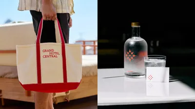
Grand Hotel Central
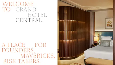
Where Things Happen First
Grand Hotel Central embodies Barcelona’s history and the visionary spirit of its founder, Francesc Cambó. Its rebranding blends legacy with modernity, pleasure, and connection, making it a hub for creative and entrepreneurial minds. Celebrating visionaries and nonconformists, the hotel honors those who shape the future.
Industry
Hospitality
The rebranding process embraces this timeless essence, celebrating the spirit of the “Grand” hotels era by reinstating the same level of hospitality and attention they were known for. The result is a brand that redefines urban luxury, offering an effortless elegance marked by a visionary spirit and a forward-looking perspective.
Symbol
The hotel is filled with classic and modern architectural elements that represent botanical forms. The symbol was designed and inspired by these centric and geometric shapes. It synthesizes the concepts of genius, discovery and gathering in a centric form: the elements are repeated directed to a central point between form and counter-form, making it possible to represent both the sparkles of a new idea and a botanical element.
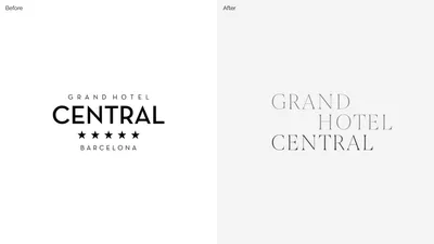
Logotype
The main logotype was designed with an elegant serif font (Joane Thin) in a dynamic composition of lines and aligned by two main vertical axes between G-C and N-H. Both the symbol and the logotype, the brand consolidates the hotel’s authenticity and history with an elegant personality and a forward-thinking attitude, representing an urban-social experience of Barcelona.

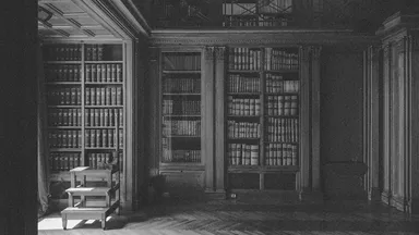
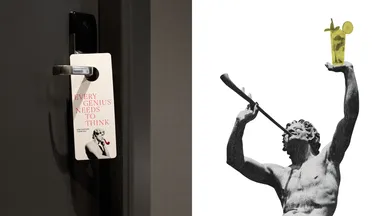
Hidden Secrets
The hotel has many years of history, and consequently many hidden secrets. Most of these secrets are part of the architectural decoration of the hotel, which was formerly the home of founder Francesc Cambó. The hidden elements present in the hotel were used to the brand’s visual language. All of these unexpected elements such as sculptures, images and objects represent a fusion between a neoclassic and modern environment.
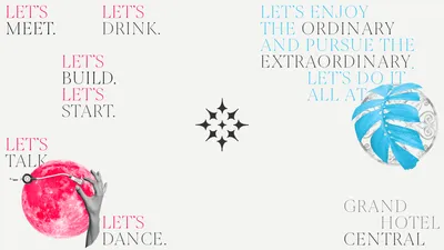
Type Compositions
Just like the logo, we used Joane in thin weight as the brand’s main typography. It should be used for titles and compositions that strengthen the brand narrative. This serif typography has high contrast between verticals, diagonals and horizontals, delicate and elegant curves. We played dynamically with the composition of the titles, where each line starts and ends in a different position.
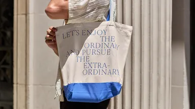
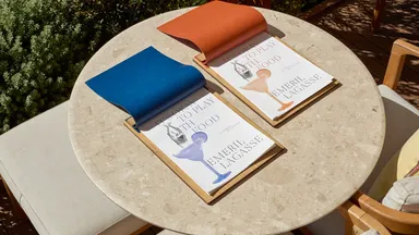
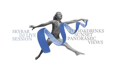
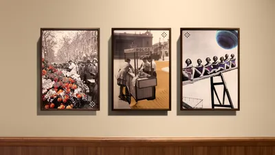
Collages
In order to emphasize the contrast between modern and classic, we used collages as another graphic element of the brand. We play with the collages to represent the social and open-home environment. Most of them reflect energy and moments of celebrations.
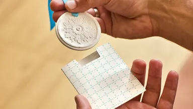
Patterns
Using the same shapes that creates the brand’s symbol, we designed a family of patterns. These shapes are replicated and composed differently for each. It can be applied to fabrics and other communication pieces in different colors.
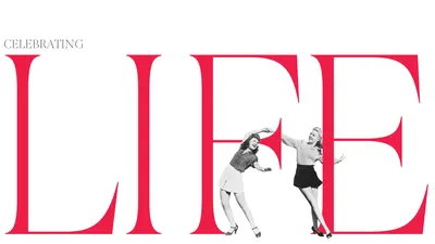
The new rebranding invites people to immerse themselves in the creative energy of their surroundings while finding refuge in carefully curated spaces that foster connection, inspiration, and leisure. This balance between vibrant city life and serene hospitality defines a way of celebrating life — through meaningful experiences, timeless elegance, and the pursuit of pleasure.
If you have any brand enquiries, don’t hesitate to get in contact with us.


