Value
Meaning
Future
Designed
Work Technology
0 Ipad Portada DIGIO

Digio: Beyond binary

Aiming to strengthen its perception as a leader in the digital product development sector, Digio sought a brand identity that would merge their extensive technical expertise with a comprehensive approach to digital solutions. From crafting a brand narrative to creating a very ownable visual language, this rebranding enabled Digio to not only stand out in a crowded marketplace, but also to establishing them as a solid and experienced company.

The Challenge

Digio, a software and digital product development company, embarked on a rebranding journey to strengthen its position in the market, aiming to establish itself as a dominant player in the digital realm, attracting to both established enterprises and emerging startups.

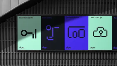
Beyond showcasing its technical proficiency and wide experience in a wide variety of projects and industries, Digio aimed to showcase the full spectrum of its capabilities, transitioning from technical expertise to offering end-to-end solutions — from the concept to the user experience.

Additionally, aligning its brand identity with core values was crucial to stand out amidst the competition. These imperatives led Digio to undertake a comprehensive rebranding effort, fostering growth and realizing strategic goals.

The Strategy

The combination of Digio’s team’s technical expertise and their pursuit of impactful solutions for their clients’ businesses established “Transformation” as the cornerstone of their narrative. This balance was crystallized in the tagline “Transformation is our code_”, signifying their commitment to driving change as a shared goal for every digital challenge they face.

We unearthed the symbolic significance of the binary digits within Digio’s name (Dig10), using it as an inspiration for the brand narrative, portraying Digio’s contribution as what lies between zero and one. Digio lives in the vast universe between these two figures, full of uncertainty and possibilities. In that intermediate space between vision and creation. Between non-existence and existence.

The Solution

Both the logotype and visual language play with the concept of transformation and the binary code in a variety of ways.

From an icon set created based only on zeros and ones, to the symbol stretching and the creation of an extended visual language, the brand breathes a digital essence through all of its touchpoints.

The combination of Digio’s team’s technical expertise and their pursuit of impactful solutions for their clients’ businesses established “Transformation” as the cornerstone of their narrative.

Transformation is our code_ signifies their commitment to driving change as a shared goal for every digital challenge they face with a nod to the binary code.

4 Mobile Home

The color palette chosen uses black and white as the main colors and grey as an intermediate tone. On a second hierarchy level, a soft green and a violet were chosen to embrace Digio’s digital nature.

6 Color palette

The symbol is a synthesis of the binary code concept. Digio lives in the space between these two figures, full of uncertainty and possibilities. In that intermediate space between vision and creation. Between non-existence and existence.

8 Avatar
9 1 Ipad Cero a Uno

The icon system reinforces further this idea taking it a step beyond. The creation of a versatile icon library based on ones and zeros was the first step of the development of a thorough visual language.

10 Digio OOH 48
12 Icon Library

Based on the company’s values, the visual language stretches itself to create an easy and comprehensive system that gives a cohesive look that goes from solid to flexible in the blink of an eye.

14 Website Blog
15 3 Posters OOH
16 Camiseta Digio
17 Bolsa Agenda
18 Tarjetas Personales
19 Oficina
20 Totebag Digio
21 Agenda