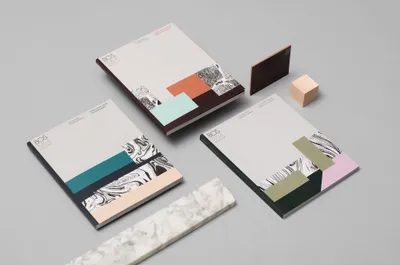
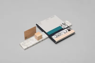
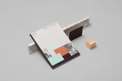
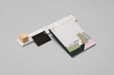
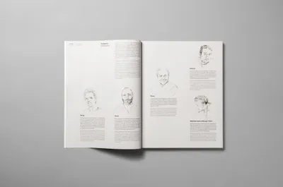
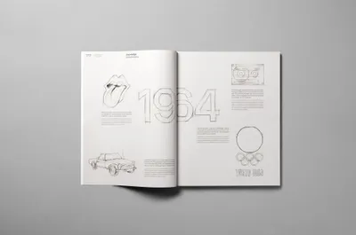
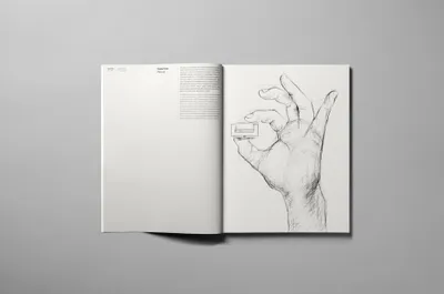
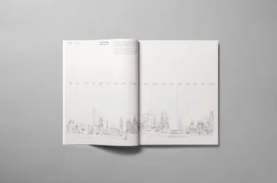
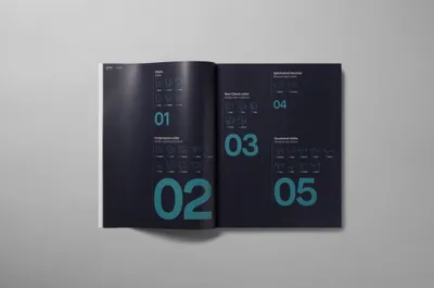
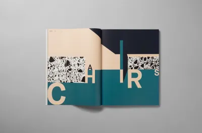
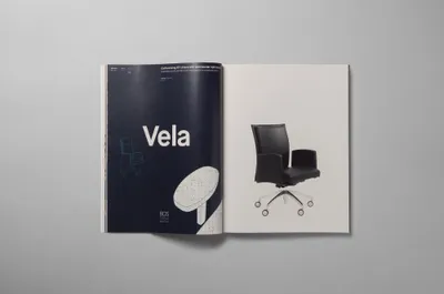
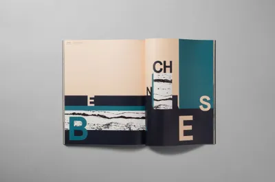
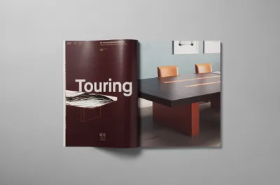
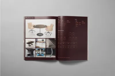
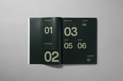
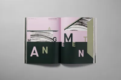
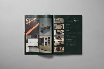
To refresh their catalogs, BOS engaged Mucho. Initially, we coined the tagline, “The executive furniture company,” reflecting their niche. We then created a graphic language that resonates with their primary clientele - architects. Inspired by the shapes and proportions in Mies van Der Rohe’s architecture, the language employed textures from BOS’s products, demonstrating their high-quality materials.
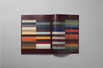
A distinct color palette and chromatic code aided in differentiating and identifying catalogues and product types. Lastly, illustrations by Judit Maldonado, based on architectural sketches, added a human touch to each product, aligning with the brand’s strategic values.
