Cure
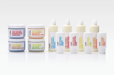
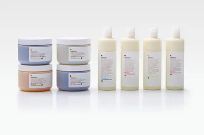
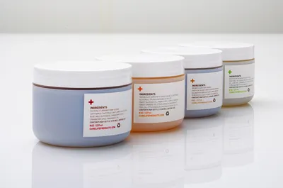
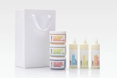
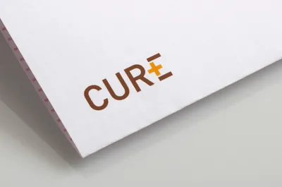
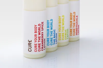
Cure is a skin care company on a mission. For every sale of a product Cure donates a percentage of the profits to a selection of charities that are close to the heart of the CEO. To demonstrate this positive mission we developed a logotype that pulled out a ‘+’ symbol in thetter E of the brand name Cure. The packaging uses minimal typography to explain the cause with a fresh color palette representing the scent and ingredients of each product.
Services
Packaging
Industry
Beauty & Self-Care
