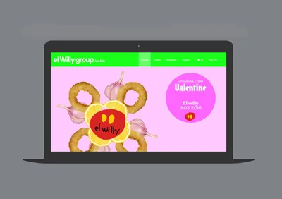
The solution hinged on employing a typeface with strong character reminiscent of traditional Spanish bars, owing to the brand’s Spanish roots. Content was hierarchically arranged to produce a compelling and humorous narrative around color and classic Spanish ingredients such as ham, chorizo, and tomato. To encapsulate this diverse universe in a single page, unique graphic kaleidoscopes were designed for each restaurant, providing identity and a platform for sharing social activities.
Furthermore, a common template was developed for each restaurant website, ensuring individual presentation and booking spaces within the same framework.


