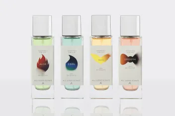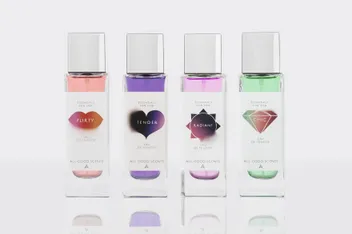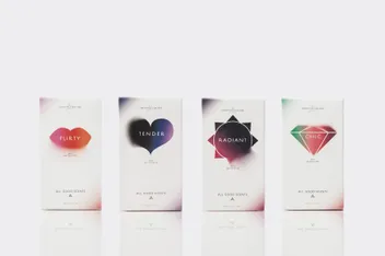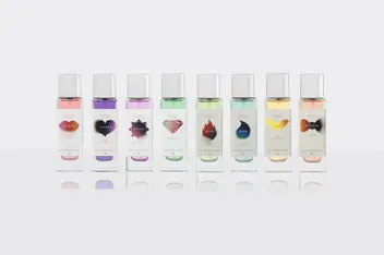
Our packaging journey began with the Essentials range. Pictographic illustrations, when blurred, provided a visual representation of the brand ethos: perfume as a volatile lifestyle element.
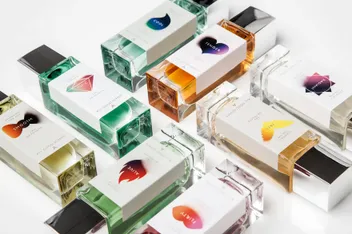
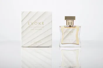
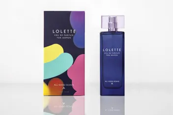
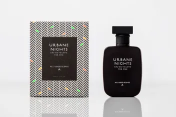
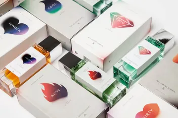
Building on the Essentials, we designed four unique, premium perfumes. Lolette uses 80s-style color strokes, Urban Nights combines tweed texture with fluorescent color, Arise uses earthy color gradients, and Evoque employs an art deco white pattern with golden touches.