This project began with the unique camaraderie of four friends united by their passion for running marathons. They noticed a gap in the market for cosmetic products specifically designed for athletes, prompting them to envision a range tailored to their unique needs. The initial challenge was to devise a name that encapsulated a contemporary interpretation of sportsmanship, a concept that would resonate with athletes of all genders.
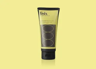
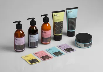
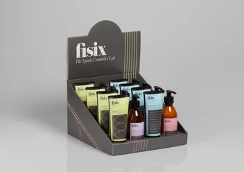
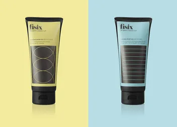
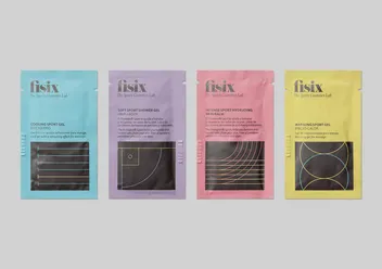
With the name established, we then turned our attention to the brand’s visual identity. We embarked on the creation of a distinct visual system, drawing inspiration from the lines found on sports courts and fields. By cropping and reinterpreting these lines, we were able to create abstract shapes evocative of freedom and dynamism, mirroring the liberating spirit of sports.
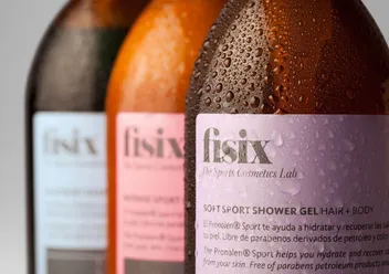
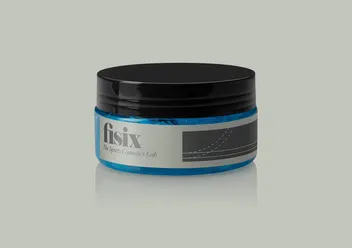
The final phase of the project revolved around the selection of an appropriate color scheme and typography. We chose a harmonious blend of pastel hues and dark grey, reflecting the delicate balance between strength and subtlety in sports. The logo employed elegant typography to appeal to both masculine and feminine audiences, underlining the brand’s commitment to inclusivity. The combination of abstract design, color palette, and typography culminated in a dynamic, contemporary brand identity that resonates with the modern lifestyle of athletes.
