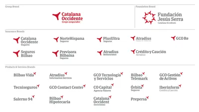
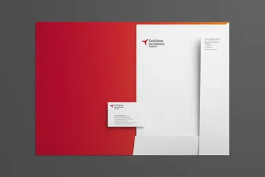
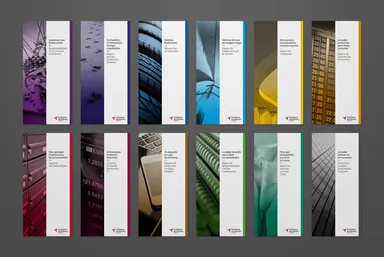
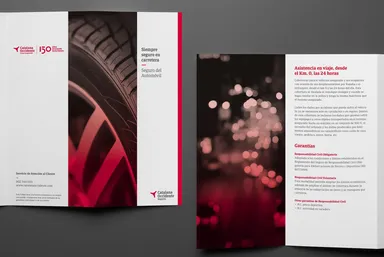
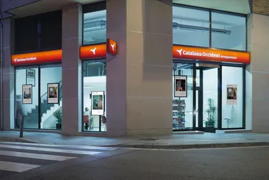
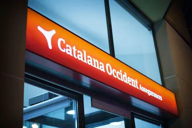
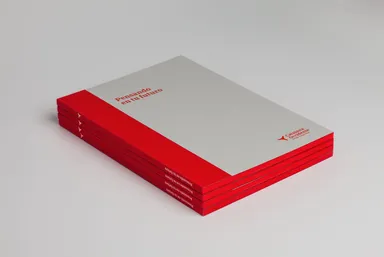
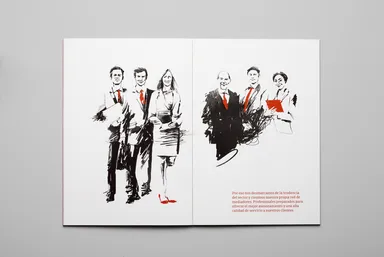
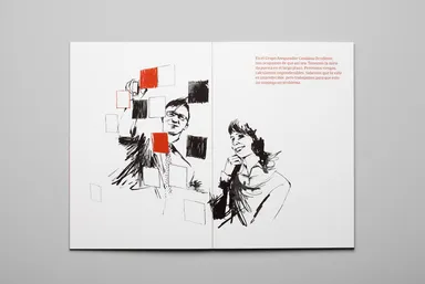
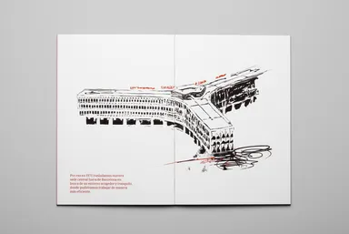
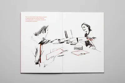
Logo Logo
  • Work
  • Strategy
  • Sharing
  • About
  • Shop
  • Contact
  • Work
  • Strategy
  • Sharing
  • About
  • Shop
  • Contact

Catalana Occidente

A solid background, a rebranded future

Industry

  • Corporate Services

Services

  • Brand Identity
  • Environmental
  • Print
  • Signage
  • Strategy

The Catalana Occidente project began with the need to renew the brand for their 150 anniversary. Before designing we interviewed the leaders of the group to get to know first hand the history, values and vision of the company. This development work was useful for understanding the project and deciding the strategy.

Mucho invites you to think. Mucho obligates you to focus. Mucho challenges you to deepen your essence. It is then, and only then, when they are ready to start. Seriousness. Warmth. Flexibility. Common sense. And lots and lots of creativity. Mucho is not only mucho, it’s much more.

Hugo Serra
Deputy General Manager
Catalana Occidente Group

Evolution of the symbol

The new symbol is an evolution of the previous one. We started using the shape as a silhouette, suggesting the form of their emblematic headquarters.

Vision

Previously the Catalana Occidente Group had been actively acquiring other insurance brands. Our analysis detected the need to create a clear brand architecture to help organise more than 50 existing brands. We decided to unify the typography, the symbol and the colours of the insurance brands. The brand companies maintained their names due to their history and local roots. This allowed us to leave out the brand group endorsement for the insurance brands. The next step was to create order and a hierarchy in the brand portfolio following this scheme: Brand group, foundation, insurance brands, investment / management brands and finally products and services brands. Once all the basic corporate elements had been defined, individual insurance brands were able to develop their own communication language and art direction.

Bespoke typeface

We commissioned Eduardo Manso to do the corporate typeface. We developed a contemporary slab serif font, slightly more condensed than usual to allow for the length of a lot of the brand names. A sans serif version for text usage completed the typeface family “Catalana”. All the Catalana Occidente Group brands are solely insurance companies. They are insurance experts and they stand out because of their unique network of agents. Therefore we created the tagline: “Thinking about your future” highlighting that it is about connecting with the end consumer.

Signage

The Catalana Occidente Group has more than 1800 offices, we worked closely with their in-house signage department and with experts at 3M. After a lot of prototypes, we created a signage system with personality, creating visibility for the brand, working equally well by day or when backlit at night.

Brand activation

To launch the brand to employees a video was made and projected at the annual agents meeting. We wanted the video to convey the sense of effort and personal touch in the way it was made. To achieve this we created a classic animation, drawn by hand, frame by frame. This resulted in 1400 illustrations of Oriol Malet which together made up the video. The copy by “Contents” used a storytelling structure to explain the values of the brand. The classical music score was created by “the Pinker Tones” The video was enthusiastically received by everyone in the presentation. A brand book explaining the values and the company’s 150 year history was also handed out.

Website

Content, design and typology of the user dictated the web architecture. An initial parallax design allows new users to discover all about the Catalana Occidente Group in a visual, quick and dynamic way. For the more enthusiatic user, there is a second level that is now more visual and navigable.

Iconography

We also created an icon family with more than 120 icons. In order to maintain consistency of the brand throughout every location, we created a BrandHub where employees can view the basic elements that create their visual identities. Manuals, logotypes and applications can be quickly downloaded and managed within the corporate guidelines. We also introduced the idea of a Brand Guardian to help the communication department correctly apply the brand at all levels.
Mucho continues to help guide on a strategic level, allowing us to help steer and evolve the brand in the future.

Contributors
Copywriting: Contents Editors
Illustration: Oriol Malet
Music: Pinkerland
Edition: Oscar “Hove” Gonzalez
Sound: Flow Audio & Idea Sonora
Voice-over: Alex Warne

Related projects

169

The Ocean Race Around the world, with the planet at heart

193

Cuatrecasas Reshaping the identity of Europe’s leading 100-year old business law firm

241

Movistar+ An identity for the merger of two media megabrands

253

Cobega Evolution makes sense

We look forward to hearing from you. For new business, please contact the closest office directly. For general enquiries, please email us: info@wearemucho.com
San Francisco

+1 415 546 1399
sanfrancisco@wearemucho.com

466 Geary Street, Suite 500
San Francisco, CA 94102

Melbourne

+61 414 867 860
melbourne@wearemucho.com

Office 3, Level 2
358 Lonsdale Street
Melbourne VIC 3000

Barcelona

+34 93 481 40 89
barcelona@wearemucho.com

Morales, 27K
08029 Barcelona

Paris

+33 (0)1 73 71 58 20
paris@wearemucho.com

80 rue Taitbout
Square d’Orléans
75009 Paris

Copyright © 2023
  • Terms
Subscribe
Logo