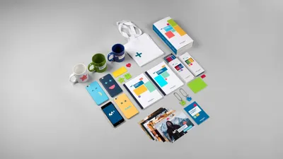
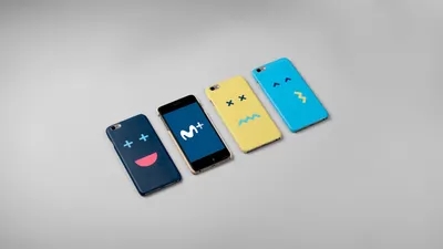
Value
Meaning
Future
Designed
Work Corporate_Services
Movistar+ Logo

Movistar+

Selected to spearhead a significant corporate identity project, Mucho and Cómodo Screen were tasked with amalgamating the identities of Canal+ and MovistarTV into a singular, compelling brand, Movistar+.

The Challenge

The main challenge was to distil the essence of two well-known brands, Canal+ and MovistarTV, and to create a unique and recognizable identity for the new venture, Movistar+. This new brand needed to position the audience at the centre of a multichannel digital ecosystem, requiring a distinctive identity that captured the spirit of both parent brands while engaging viewers in a novel way.

The Strategy

The strategy revolved around the idea of community and recognition. We wanted to foster a sense of belonging among the viewers, facilitating them to share their individual moments and emotions. Instead of merely absorbing viewer opinions and content, the brand aimed to be a superfan, watching and co-producing content with its audience, continuously sharing co-created moments. This transformed Movistar+ into a space for community.

The Solution

The design solution involved the creation of an interactive ‘M+’ symbol that embodied brand values and engaged directly with the audience. We also introduced a new typography and developed a multiscreen graphic language, reflecting our connected reality across various channels. ‘Emovicons’ were added to further develop an emotional voice for the brand. 

On air, the ‘M+’ symbol acted as a visual narrator, while the ‘+’ sign served as a cursor. The identity was designed to be flexible across different platforms (IPTV, DTH y OTT), resulting in a cohesive and easily navigable user experience.

16 Emovicons
36a Movistar interstellar
36b Movistar Messi
40 Movistar Mucho strategy design graphic