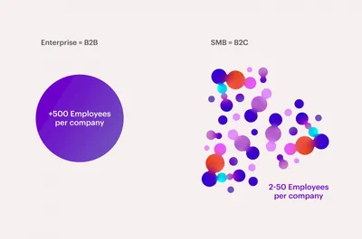
Logo Logo
  • Work
  • Strategy
  • Sharing
  • About
  • Shop
  • Contact
  • Work
  • Strategy
  • Sharing
  • About
  • Shop
  • Contact

Make

Branding a SAAS Automation Gamechanger

Client

  • Make

Industry

  • Tech

Services

  • Brand Identity
  • Digital
  • Motion
  • Naming
  • Strategy
  • Tone of Voice

We were approached by Integromat, a visual language based integration and automation platform, to do a complete redesign of the brand. The leadership was already aware of the key issues they were facing: a lack of a clear brand narrative, competitors with much higher conversion rates due to better and more appealing communication, and an overall identity that looked boring and outdated. It was time to change, and so we got to work.

Brief Considerations

We started working on the brief together, and conducted a strategic analysis. We quickly diagnosed some key project factors. Firstly, we established the incredible growth of automation processes, and how key this was to the narrative. The automation and integration in one platform of sequences of tasks connecting different apps is possibly one of the most important shifts in the evolving mindset of millions of small entrepreneurs.

B2B to B2C

Secondly, we reframed the understanding of the market context. Integromat presented itself as a B2B company, because their customers where small and medium businesses. But the companies where in most cases really small, and their number quite big. Big audience, regular people? This didn’t sound like a professionalized highly specialized B2B sell. It sounded like broad market B2C sell. And indeed it was. The benchmark for that kind of audience was radically different, much more engaging, vibrant and down to earth.

The Value of Augmenting Humanity

Make helps you make more, do more, achieve more. It is, like all human technology, a prothesis for extending our capabilities. But in an era where new tech tools grow exponentially, the value of augmenting human capabilities presented itself as a strong contender for true purpose. Along with it came 5 differential values: holistic automation, visual language, collective evolution, a creative lifestyle and a one solution product. The value proposition, unlimited possibilities, and the freedom to innovate on what being human means.

The Brand

The logotype was based around the concept of a chain reaction. Inspired by a domino Rube Goldstein machine, this idea how one small gesture can ignite a chain reaction. And it became the perfect metaphor for automation scenarios, which ignite a whole set of actions after just one click. Three dominos arranged to also hide, for those willing to see, the initial ‘M’ for Make.

Brand Experience and Visual Language

To design the visual language it was key to understand the product and the essence of what it offered. It was already highly designed, visual language itself being a strategic differential pillar for the brand, and had some iconic visual features. It needed to deal with the logos of all the apps it connected, and so by definition, the whole visual narrative was conditioned by hundreds of external brands, and would also have to support them. It was mission impossible for a co-branding effort. As with many complex problems, the best approach was simplicity. Through the use of bubbles we could allocate many different logos next to each other achieving a certain sense of unity. The liquid quality of the bubbles then allowed for all sorts of relations and mergers between them to suggest the connection between apps and provided an extra level of experience to the brand behavior.

Brand Communication

The visual language was instrumental to producing a set of communication assets that the brand needed from day one. We designed a set of icons related to the proportions of the logo and the visual language. We adapted the brand behaviour to photography to produce banners, social media posts, and promotions. This brand is one built on collective evolution and a close relation with a fan based community of costumers. We produced photography art direction intended to portray experts, and capable of including selfies made by the customers themselves. We adapted the visual language to illustrations to portray the actual product. All of this development allowed for the brand to express itself on its website, social media, advertising and branded content communication.

Related projects

24

Visa A symbol of change

92

Meight Driving Together

95

Deem Easier to travel anywhere

114

Koble Code for insurance, branded

We look forward to hearing from you. For new business, please contact the closest office directly. For general enquiries, please email us: info@wearemucho.com
San Francisco

+1 415 546 1399
sanfrancisco@wearemucho.com

466 Geary Street, Suite 500
San Francisco, CA 94102

Melbourne

+61 414 867 860
melbourne@wearemucho.com

Office 3, Level 2
358 Lonsdale Street
Melbourne VIC 3000

Barcelona

+34 93 481 40 89
barcelona@wearemucho.com

Morales, 27K
08029 Barcelona

Paris

+33 (0)1 73 71 58 20
paris@wearemucho.com

80 rue Taitbout
Square d’Orléans
75009 Paris

Copyright © 2023
  • Terms
Subscribe
Logo