The Challenge
The Foschini Group (TFG) is South Africa’s leading fashion and lifestyle retail group, with more than 3k brick and mortar stores and a portfolio of 29 brands that speak to every generation, segment, taste and style, spanning Africa, the UK and Australia. Today, TFG houses both proprietary and independent global brands like Markham, G-Star Raw, @home or Totalsports.
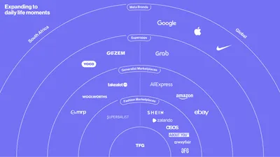
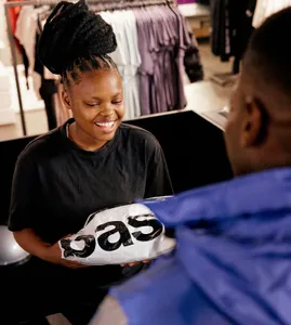
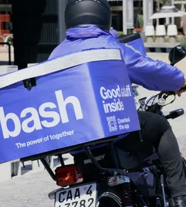
In late 2021, the Group embarked on a journey to become the leading omni-channel retailer in South Africa, by building a new digital platform that would not only embrace TFG’s fashion and lifestyle brands—at the moment selling online through MyTFGWorld, the group’s e-commerce toolbox—but a myriad of third party brands, products and services, all living under one integrated ecosystem. A world-class digital team and one of the most innovative tech labs in Africa, TFG Labs, was born with the mandate of accelerating TFG’s digital strategy and the ambition to become the leading high-tech omni-channel retailer in South Africa. How? Building a new digital-native platform where not only shopping, but daily live’s moments and everyday choices would intersect.