Logo Logo
  • Work
  • Strategy
  • Sharing
  • About
  • Shop
  • Contact
  • Work
  • Strategy
  • Sharing
  • About
  • Shop
  • Contact

Multiplica

The Relevant Company

Industry

  • Tech

Services

  • Brand Identity
  • Motion
  • Strategy
  • Tone of Voice

With extensive experience and a presence in 7 countries, Multiplica had consolidated a positioning centered around UX design, although this was only part of its services. The challenge was to be able to demonstrate it with forcefulness and leadership.

As a digital consultancy whose expertise is in helping companies generate experiences for their clients, Multiplica seeks to define a differential positioning. One that allows them to get away from only being a commodity service to one of value for the customer. Representing what the brand really is today, but that it can also represent it in the future. A future that involves building relevant, intelligent and persuasive digital experiences that generate impact and results. A future where to position itself as a leading consultancy in digital transformation.
A single global brand

After more than 20 years growing globally, Multiplica created an “ecosystem” of independent brands that encompass all instances of product development and digital processes. While this structure had paid off, it had also become a cluster of unintegrated and fragmented brands across countries.

In this way, we accompany Multiplica in the construction of a monolithic brand; integrated and collaborative. So that in this way it would increase its value and visibility and promote itself as a solid global company. A single brand with specialized business intelligence throughout its customers’ journey.

With impact and credibility

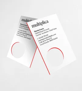
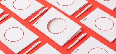
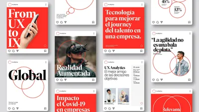
In order to show itself as a leading company among the largest benchmarks in the sector, Multiplica now projects a much more modern and attractive image. Therefore, the new visual language shows credibility and confidence as well as solidity and experience. The Ivar Display typeface provides the expert image you need in a modern way.

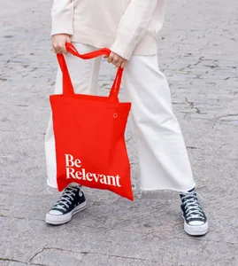
The color orange has always identified them as a dynamic and enthusiastic company. The new, more digital and contemporary tone endows the brand with greater strength, energy and determination.

Multiply your ideas

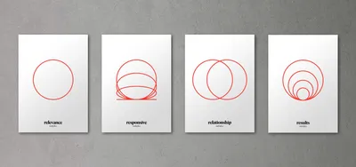
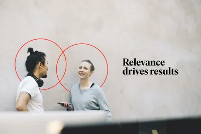
Only by working hand in hand with the customer is it possible to truly design commercially intelligent digital experiences. For this reason, the circumference takes on an entity throughout the visual language, linking itself with the rest of the graphic elements in an agile, versatile and clever way. Reinforcing and  highlighting the relevance of relationships.

Related projects

94

Glassworks Handcrafted Imagination

108

Trizz Images are Moving

114

Koble Code for insurance, branded

204

Oylo A narrative for trust in cyber security

We look forward to hearing from you. For new business, please contact the closest office directly. For general enquiries, please email us: info@wearemucho.com
San Francisco

+1 415 546 1399
sanfrancisco@wearemucho.com

466 Geary Street, Suite 500
San Francisco, CA 94102

Melbourne

+61 414 867 860
melbourne@wearemucho.com

Office 3, Level 2
358 Lonsdale Street
Melbourne VIC 3000

Barcelona

+34 93 481 40 89
barcelona@wearemucho.com

Morales, 27K
08029 Barcelona

Paris

+33 (0)1 73 71 58 20
paris@wearemucho.com

80 rue Taitbout
Square d’Orléans
75009 Paris

Copyright © 2023
  • Terms
Subscribe
Logo