1
2
3
4
5
6
7
8
9
10
11
12
13
14
15
16
17
18
Value
Meaning
Future
Designed
Work Design_&_Construction

Anoche

Anoche is a lighting design studio founded in Barcelona in 2007. It provides exquisite lighting design for hospitality and architectural projects. Almost 20 years ago, we created the name Anoche. This time, we worked together again to evolve the brand. Their ask was to make its deep understanding of light more obvious to the market and position the studio beyond technical expertise, as a design practice with the knowledge and sensitivity to work with the magic of light.

What lies beyond the visible

Light is everywhere, yet knowledge of it is often limited to what we can see. Anoche has built its practice around understanding light in all its complexity, its behaviour, qualities and effects, combining technical expertise with design and sensitivity to shape something that is, by nature, intangible. The challenge was to make this expertise legible: to reveal what Anoche knows and sees in light that others might not, and give shape to a field of knowledge that is felt long before it is understood.
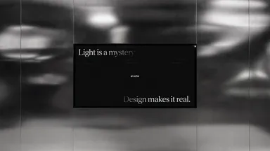
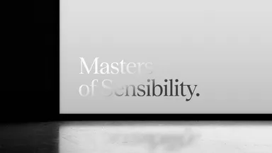
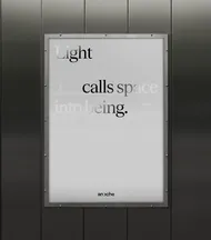
03 Mucho Anoche Branding Billboard

The Mystery of Light

We built the brand around The Mystery of Light: the space between what can be measured and what can be felt. This is where Anoche’s expertise lies, combining technical rigour with sensitivity and experience to understand and shape something that can never be fully explained.

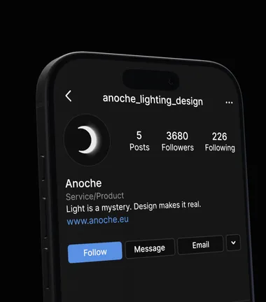
Rather than trying to resolve this tension, the brand embraces it as the foundation of its practice. It brings together Anoche’s sense of wonder about light, their intimate understanding of how it is felt, the practical wisdom that comes from experience, and the belief that the project needs set the direction of the design. Together, they express a simple proposition: Light is a mystery. Design makes it real.

05 Mucho Anoche Branding Billboard 2

Unveiling Anoche in a new light

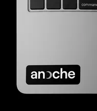
The identity makes the mystery of light tangible by turning revelation itself into a brand behaviour. At its centre, the logo plays with the “O” in Anoche, creating an eclipse-like form where light is partially concealed and revealed. It becomes a simple expression of the tension at the heart of the brand: what is visible and what remains hidden. A visual language of black and white, contrast, grain and controlled imperfection brings together the precision of Anoche’s expertise with the sensory nature of light.

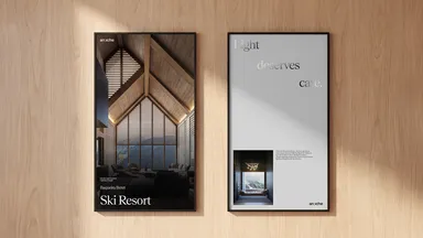
This principle extends to the way the brand speaks. Copy plays with contradiction, allowing opposing ideas to coexist and creating moments of discovery rather than explaining everything at once. Across the identity, Anoche invites people to experience and feel its way of working with light.

11 Mucho Anoche Branding Poster
11 Mucho Anoche Branding Posters 2
Mucho Anoche Branding Visual Identity Icon
12 Mucho Anoche Branding Sticker
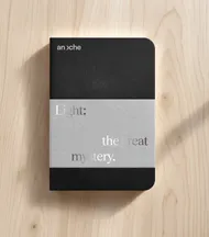
14 Mucho Anoche Branding Notebook
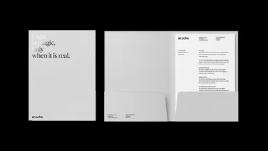
16 Mucho Anoche Branding Folder
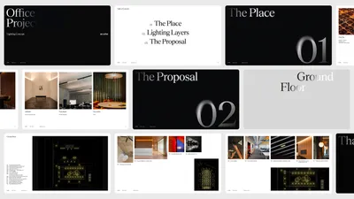
17 Mucho Anoche Branding Slides 2
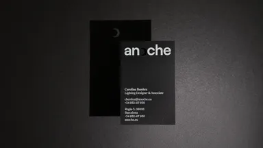
18 Mucho Anoche Branding Business Card 2