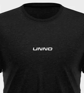
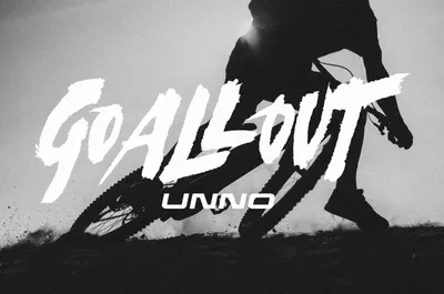
We have incorporated the spirit of the Unno team to create a brand that represents their disruptive and innovative product design. It is an iconic brand that encourages people to “go all out” and seek a personal and energetic ride. The lettering used in the brand is a unique creation by calligrapher Oriol Miró.
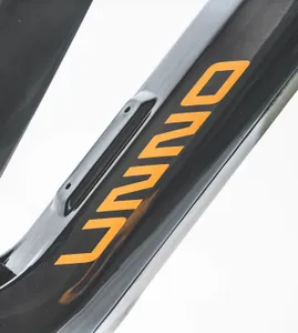
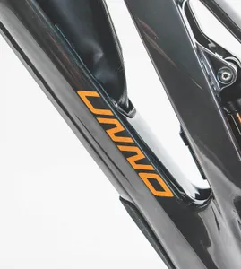
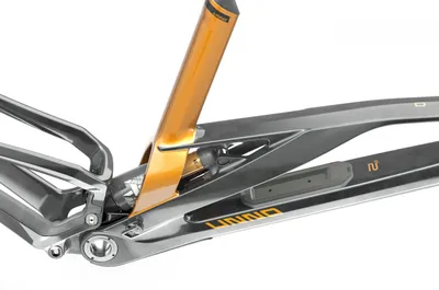
The Unno logo is inspired by the geometry of their bikes. Just like the frames, the letters in the logo combine curved and right angles, with meticulous balance in weights. We have also innovatively adapted the logo to be placed on both sides of the bike frame. Regardless of the side, both versions are fixed horizontally with the same angle, achieving a harmonious visual slope. Each version is designed to maintain a sense of unity and balance.
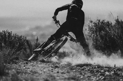
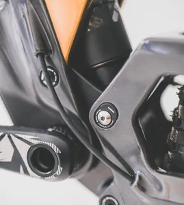
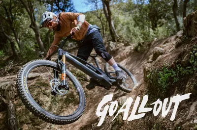
In terms of photographic art direction, we have aimed to represent Unno’s narrative of becoming the best version of oneself. The visuals showcase scenes of riders enjoying the ride and their connection with nature, emphasizing the brand’s human touch. These images are complemented by studio photographs that highlight the bike’s technology and design.
