Value
Meaning
Future
Designed
Work Food_&_Beverage
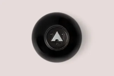
Artesa Bottle Close Up Black 2

Artesa Vineyards & Winery

In the 1980s, the historic Spanish winemaking family Codorníu Raventós began to acquire and develop vineyard land in the Carneros region of Napa Valley. Opened in 1991 as Codorníu Napa, a sparkling wine house, the winery ultimately transitioned to producing still wines as successive vintages revealed the quality and potential of the family’s vineyard holdings.

The winery was renamed Artesa – Catalan for “handcrafted” – in 1997, and has since become a leading producer of artisan wines from the varietals for which Carneros and Napa Valley are best known. Codorníu Raventós is still family owned and is the oldest company in Spain with a winemaking legacy in the Penedès region near Barcelona that dates back to 1551.

The Challenge

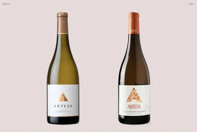
The existing identity and packaging didn’t feel Spanish or particularly unique. As with many wineries in the Napa Valley region the identity felt like a pastiche of established French wine packaging. Mucho was tasked with developing a brand that felt Spanish and appealed to an American audience. The brand and labelling system needed to stand out on a crowded supermarket shelf, it needed to feel more Spanish and highlight the unique story and heritage of the company. It was essential that the packaging system did a better job in differentiating the products by varietal and price point.

The brand as a whole had to feel more artisanal as this was where the name of the winery came from in the beginning.
Screen Shot 2023 06 26 at 12 28 03 PM

The Strategy

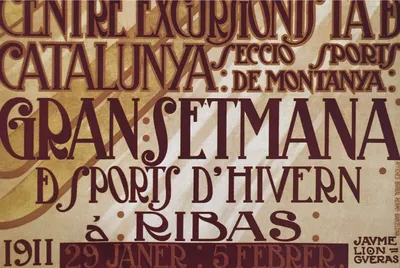
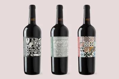
We looked back in order to move forwards. Codorníu Raventós dates back to 1551. Therefore there was a great deal of history and heritage to be inspired by – Typography, imagery, architecture and tiles, color palettes. This needed to feel authentically Spanish, as opposed to a pastiche and cliché of Spain — a style adopted by many other Napa Valley Wineries when they try to ‘look old/established’.

Screen Shot 2023 06 26 at 12 22 56 PM
Screen Shot 2023 06 26 at 12 23 05 PM

The Solution

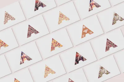
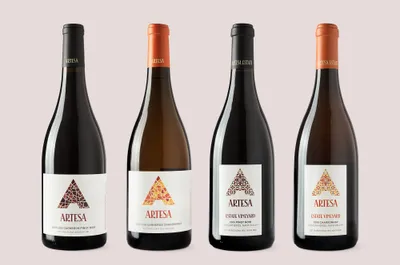
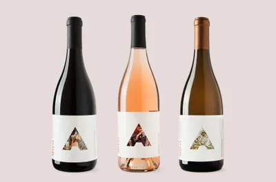
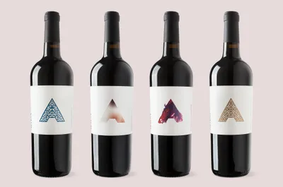
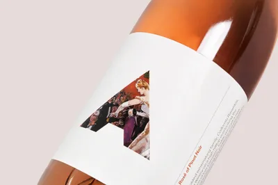
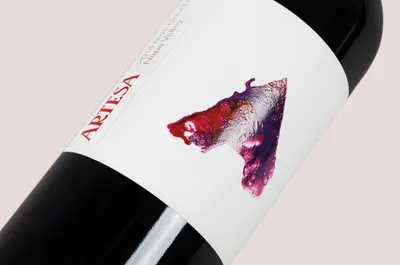
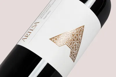
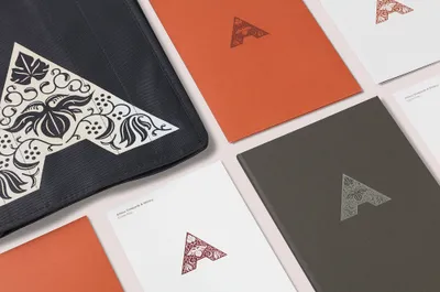
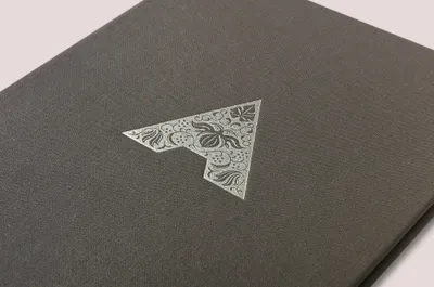
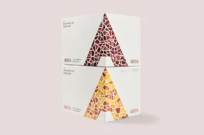
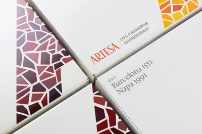
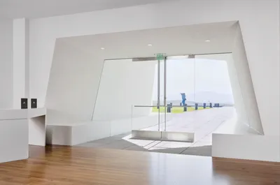
We developed a bold ‘A’ logo/window that was derived from the shape of the winery and entrance in Napa. This shape could then be filled with crops of original Codorníu posters, and illustrations. Each illustration related to the story behind that particular varietal. We also used labels sizes and print techniques to differentiate the packaging in terms of value. For the Carneros Chardonnay and Pinot Noir range we filled the shape with a mosaic, reminiscent of the Gaudi Mosaics typically seen in Barcelona. As the products became more expensive so too did the elegance and quality of the illustration.

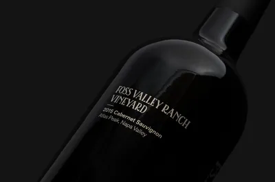
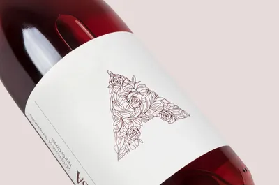
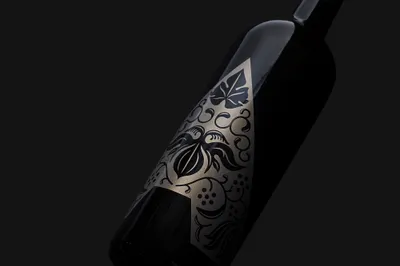
A bespoke Artesa typeface was created referencing the typography used in original Codorníu Art Deco posters. We also developed a calligraphic illustrative ‘A’ that is used as the overall logo and silkscreened directly onto the bottles for the Estate Vineyard products.

Artesa B Cards
Artesa Bags 1
Artesa Bottle Close Up Black 2
Artesa Bottle Close Up Black 1
Artesa Stationery 1
Artesa Menu Close Up
Artesa Boxes 2 Up
Artesa Boxes Close Up
Screen Shot 2023 06 26 at 12 45 09 PM
Screen Shot 2023 06 26 at 12 45 23 PM
Screen Shot 2023 06 26 at 12 45 40 PM