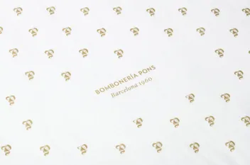
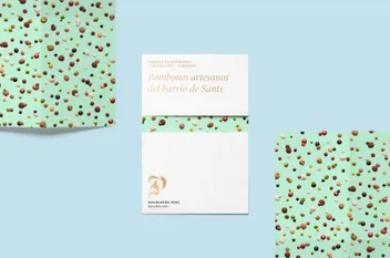
We simplified the color palette to white and gold, allowing the product to be the most prominent element of the new identity. Developing this visual language helped showcase the variety of their products.
As a result, the repositioning of the chocolates in the market occurred without losing the brand’s traditional equity, and successfully attracted a new, younger customer base.


