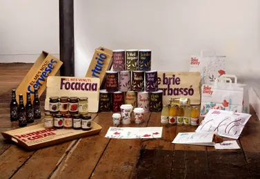
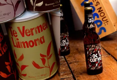
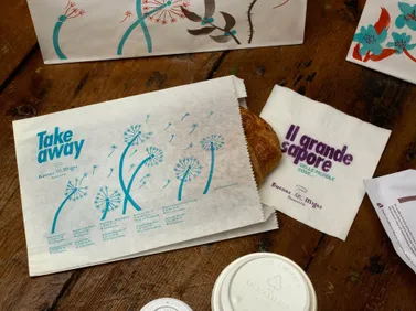
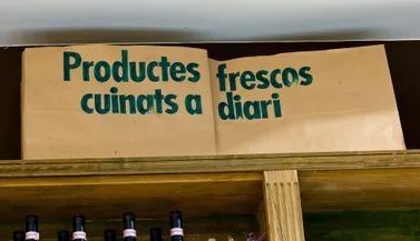
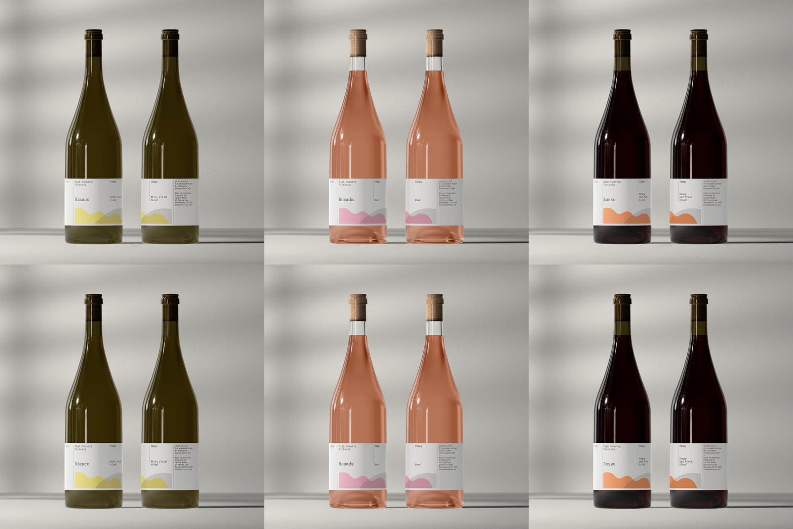
Our idea was straightforward - mirror the restaurant’s commitment to craft and natural ingredients by constructing a palette of entirely handmade visual elements.
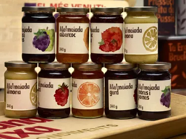
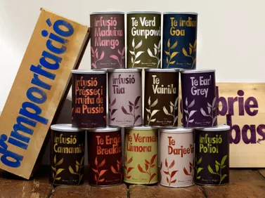
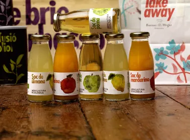
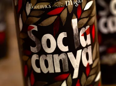
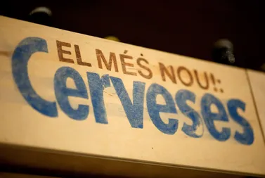
As a result, graphics for product labels, bags, boxes, coffee cups, price tags, and signage were all crafted by hand. Even in instances of mass reproduction or large-scale production, we preserved the handmade, artisan spirit through the choice of type, illustration, and color. We chose a robust, commercial typeface - Futura condensed bold - to complement this handmade ethos.
The juxtaposition of delicate watercolor illustrations with a bold typeface gave Buenas Migas a mainstream yet distinctively edgier and more natural identity that distinguishes it from its competitors.
