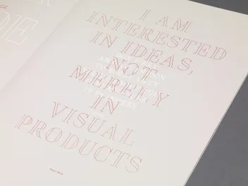
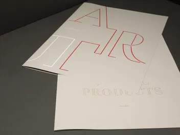
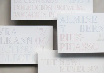
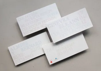
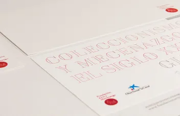
Thus, the typeface enables effective communication with a traditional or elitist audience, while still appealing to a younger or more experimental demographic. The design embodies the proportions of a didone and the essence of a classic outline serif, whilst employing a more rational and geometric approach typical of an outline sans serif.
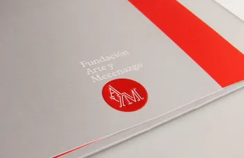
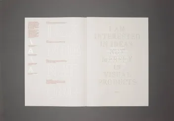
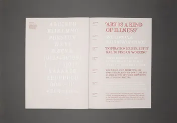
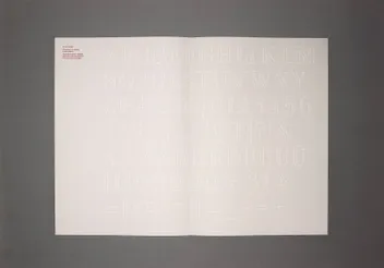
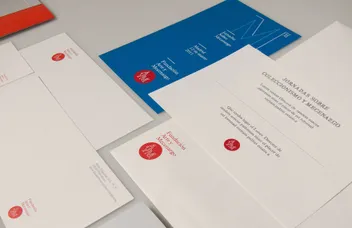
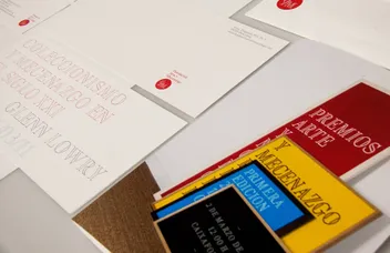
To present the typeface to the foundation’s board, we designed a type specimen detailing the font design and illustrating the range of design possibilities it offers.
