Value
Meaning
Future
Designed
Work Arts_&_Culture
1

Museu de l’Art Prohibit

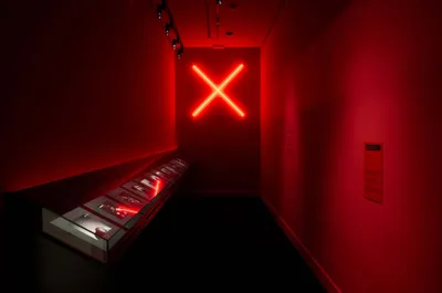
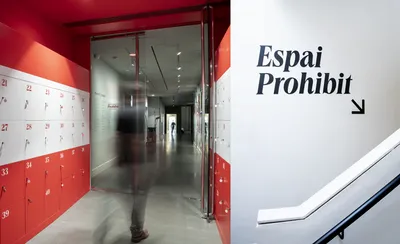
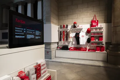
Mucho took on the challenge of branding the Museum of Forbidden Art in Barcelona, housing censored works from worldwide, including pieces by renowned artists. The mission was to leverage the controversy, emphasizing the spirit of doubt and unyielding debate as the brand’s core values.

The Challenge

Mucho got the commission to design a new brand for the Museum of Forbidden Art, in Barcelona. Born from a private collection, the museum gathers art works which have suffered censorship or even physical, all around the world. Featuring renowned artists such as Ai Wei Wei, Keith Harring, Robert Mapplethorpe or Picasso, the art displayed produces strong emotions and contradictory feelings. An important consideration was the general bad press that ‘banning’ has in spanish society, with concerns of censorship attacking freedom of speech. And yet… some of the pieces in the collection will produce in many a reasonable doubt around the degree of exposure that they should be allowed. The challenge was precisely for the brand to capitalize on its biggest source of value: a spirit of doubt and uncompromising debate, with no stone being left unturned.

The Strategy

Digging into the values through our tailor made collaborative workshop process, we realized doubt was a really central value. The kind of doubt that we all know in our hearts, the kind that produces a dialogue, not only with others, but more importantly, in our minds. Doubt will get a conversation going in our heads, boosted by contradictions and thoughts that seem equally valid and at the same time diametrically opposed. The strategy was centered in exposing the natural doubts that art confronts us with, as a trigger to foster thought. It also highlighted the important consideration for the naming of such a great curating concept not to be reduced to an acronym. It was instrumental to highlight the ‘forbidden’ element of the brand name, almost as the core for the brand itself.

The Solution

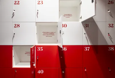
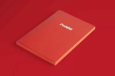
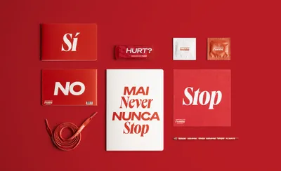
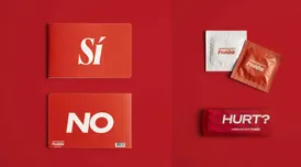
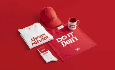
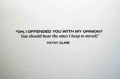
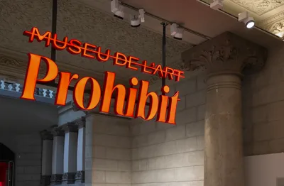
‘Forbidden’ is the trigger word for any dialogue. Using a simple gesture by crossing out the first part of the name and increasing the size of ‘forbidden’, we directed the name towards a nickname adoption by the public. ‘The Forbidden’ fixed the core value proposition in the best way. Along it, the strong and iconic ‘forbidding’ red color afforded a sense of urgency. And to this, the final part of the solution was added. Copywriting used contradictory messages displayed through opposing typefaces to showcase the imaginary conversations that might be going on in the viewer when confronted with certain art pieces. Conversations that sometimes, we might even not confess to ourselves.

2
3
The challenge was precisely for the brand to capitalize on its biggest source of value: a spirit of doubt and uncompromising debate, with no stone being left unturned.
4
5
6
It was instrumental to highlight the ‘forbidden’ element of the brand name, almost as the core for the brand itself.
7
8
Copywriting used contradictory messages displayed through opposing typefaces to showcase the imaginary conversations that might be going on in the viewer when confronted with the pieces.
9
11