Value
Meaning
Future
Designed
Work Healthcare
190205 Paradigm Headquarters

Paradigm

For almost 30 years, Paradigm has been the industry leader in managing the care and recovery of patients with catastrophic workplace injuries. Its innovative, patient-centric model for managing conditions such as spinal cord and brain injuries guarantees a defined clinical outcome for a set price to insurers.

The Challenge

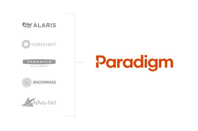
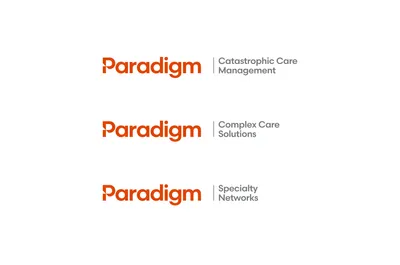
As the company grew, it aspired to help more people in more ways. Through acquisitions, Paradigm Outcomes assembled a diverse portfolio of companies. These loose affiliations were difficult to understand, however, because they didn’t fit under a common umbrella. To extend its brand leadership, Paradigm Outcomes and its acquired companies needed to become known as a unified organization that owned something broader than ‘catastrophic care.’

190205 Paradigm Business Cards

The Strategy

Working alongside our partner Marshall Strategy, we recommended Paradigm migrate its promise from ‘catastrophic’ to ‘complexity’ and amplify its message of achieving superior outcomes.

To demonstrate its commitment to this broader promise and unified approach, we recommended all acquisitions take on the parent brand, since a paradigm is ‘a new way of seeing and doing things.’ The commonality between all businesses was the solving of complex care through connected expertise — bringing in the right experts at the right time to deliver better outcomes for patients and insurers. And a key strength of the company was its innately human approach that benefits patients and their families.

To bring the promise to life, we recommended moving ‘Outcomes’ from the corporate name into a tag line we created, ‘Better Outcomes for All,’ which simplified the identity and reflected Paradigm’s commitment to achieving the very best for patients and insurers. Individual companies became service lines within Paradigm, with descriptive names: Catastrophic Care Management (the core business), Complex Care Solutions, and Specialty Networks.

190205 Paradigm Acquisition
190205 Paradigm Divisions

The Solution

Our approach to the visual identity was to emphasize simplicity, humanity and assuredness. We created a custom word mark for the corporate name, with a stylized notch in the P to symbolize a path leading to a precise outcome. This distinct monogram also serves as a memorable avatar across social media platforms.

It was important to reflect the authenticity of Paradigm’s mission through original photography, rather than relying on indistinct stock photography that is commonly found in health care communications. We met with real patients, their families and caregivers to hear their remarkable stories of recovery, and then art directed photo shoots with them to capture their unique personalities in settings that were both natural and uplifting.

To complete the overall design language, geometric shapes were taken from the stylized P to act as framing devices for photography, color and information. These elements, combined with a thoughtful typographic and infographic system, created recognizable cohesion across a wide array of printed, digital and video communications that we designed and produced.

190205 Paradigm Brochure Covers
190205 Paradigm Brochure Spreads
190205 Paradigm Website
190205 Paradigm Social Media
190205 Paradigm Booth
190205 Paradigm Guidelines