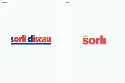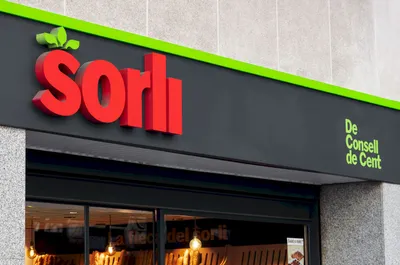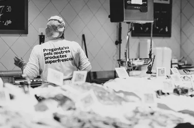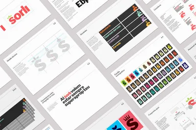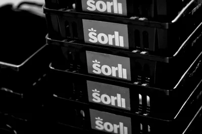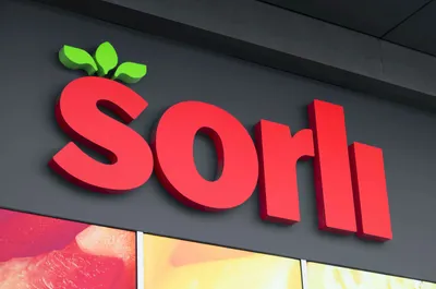
Sorli’s rebranding aimed to simplify its name while retaining an element of familiarity to maintain a connection with its customer base. The focus was to create a friendly and accessible identity that could seamlessly translate across physical stores and promotional materials, offering an improved shopping experience for all customers.
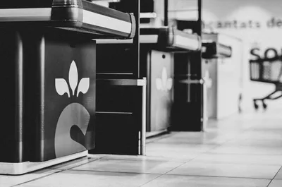
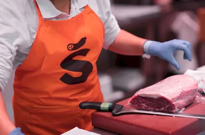
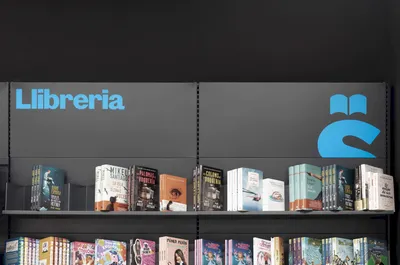
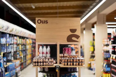
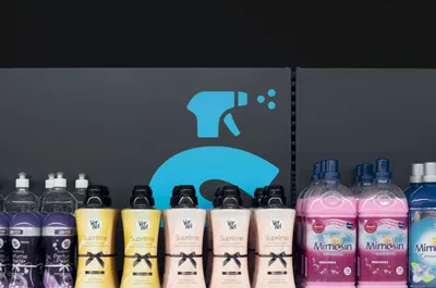
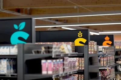
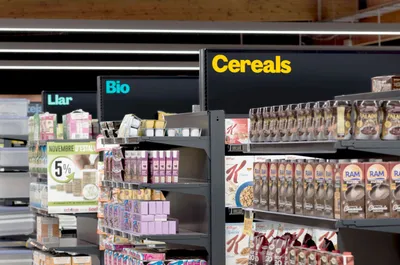
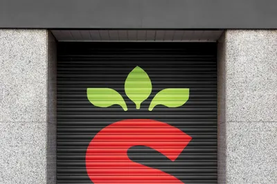
Building on the supermarket’s iconic strawberry discount emblem, Mucho transformed the ‘S’ in Sorli into a strawberry, adding leaves for a distinctive look. These unique, leafy icons became an integral part of a larger wayfinding system, guiding customers through the supermarket and injecting personality into the interiors. The strategic design solution successfully simplified the brand while preserving and enhancing its identity, providing a fresh and engaging customer experience.