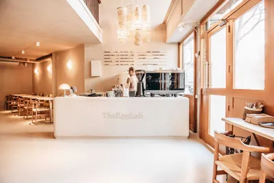
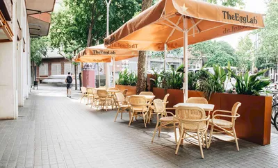
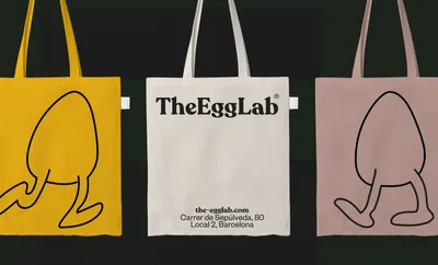
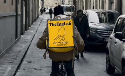
After brainstorming and working closely with TheEggLab team, we managed to pinpoint the key values and concepts that served as a foundation to develop a brand that speaks to both local and global audiences. The intent was to embody positivity, incorporating exclusive local produce that evokes a homely feel. It’s all about feeling good and doing good at TheEggLab.
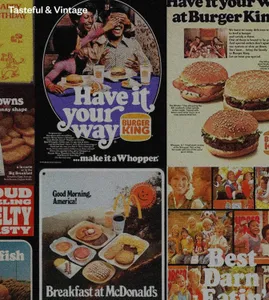
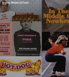
The new brand’s graphics align with its core principles and values. The logo and headline typography draw inspiration from vintage cues and delectable fast-food joints globally. Secondary typography serves as both a contrast and a tool for global, modern communication. TheEggLab’s fresh, comforting new color palette complements the interior design of the restaurant, offering a variety of tones that bring a homely feel. We introduced an illustrated brand mascot for a fun touch, which quickly became a hit with the customers.
The brand’s voice, delivered in three languages, fosters positivity and promotes a good feeling. Using ready-made phrases, we’ve played around with various meanings linked to the egg theme. On top of everything, the detailed photography showcases the delicious variety of food on offer.
