Value
Meaning
Future
Designed
Work FinTech_&_Investment
Venmo Cards Set Falling

Venmo

Venmo is the leading peer-to-peer digital payment app, and is wildly popular amongst younger, social-media savvy customers. The service upended traditional rivals by making it more fun and simpler to send payments. Mucho worked with Venmo on their first physical debit card product and experience.

The Challenge

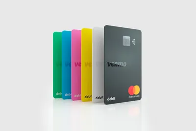
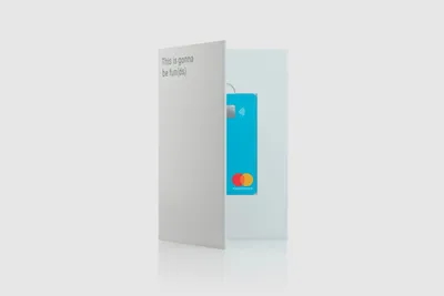
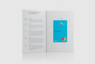
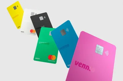
Mucho was asked to help conceive a design strategy that would define the new Venmo-branded debit card. Venmo had been a largely digital experience, but research had shown that a linked debit card would be useful to its customers by letting them access their Venmo balances for payments in more traditional retail settings.

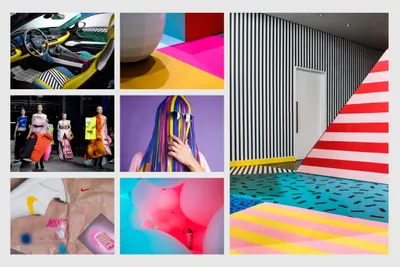
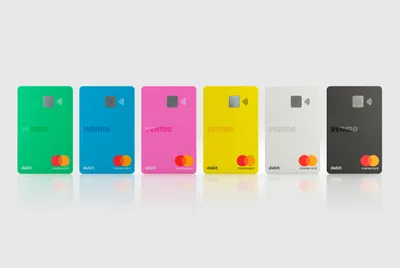
While the Venmo personality is undeniably fun, that personality is created by its customers from their postings in the app — more like a social media application than just a payment service. We therefore wanted to focus on what perceptions customers should expect from a Venmo card: a novel blend of both utility and fashion statement.

Venmo Cards Set Hero

Strategy

Our qualitative research revealed that users had little appetite for another boring card in their wallet. Being both digitally-savvy and fashion conscious, they wanted something that could be expressive of their own story — something that felt modern and surprising, but simple and elegant.

Rather than viewing the card as just a space for corporate branding, images or graphic design treatments, we decided that taking cues from product design would help establish the card as a physical extension of the Venmo experience.

This led to several design decisions.

The Solution

We designed the card to be vertically oriented. Horizontal cards are a leftover from the pre-digital era when retailers used physical card imprint devices to make a duplicate record of the raised card numbers. Now, cards are almost exclusively used vertically, like when it’s inserted into a chip reader, or swiped at a terminal. Also, a vertically oriented card mirrors the shape of a smartphone, making a conscious connection between the app and the card.

The foundation of the visual design strategy was to focus on color and materiality; more like you would find across a range of product accessories. Manufacturers often make their accessories available in a variety of colors, so that their customers can choose the color that most appeals to them, and is more representative of who they are.

To help us, we brought in one of the worlds leading color and material forecasters to create several compelling narratives and associated color palettes based on trends that would be shaping products, fashion and culture in the near future. In collaboration with the Venmo team, and informed by user testing, we arrived at a ‘playfully optimistic’ set of colors for the initial launch, in addition to a couple of simple, more discreet options.

Venmo Playful Optimism Color Palette

User Experience

By taking the approach that the card was not just another debit card, but a product that you could feel excited about, we also developed in-app concepts for how Venmo users could choose the color of their cards, and mailer concepts that signaled that the card was more special than a typical card.

We believed the experience of receiving the card should feel like a YouTube-worthy ‘unboxing’ moment that showcased it upon arrival. This mailer was also an opportunity to express the Venmo voice through language — cleverly distinctive copy that would easily and assuredly guide the customer through the activation process.

The much anticipated launch of the Venmo debit card is an exciting extension of the Venmo brand as the payment service continues to grow at an industry-leading pace. With a solid design strategy that has the flexibility to evolve over time, Venmo is well positioned to maintain (and grow) the loyalty of its massive fan base.