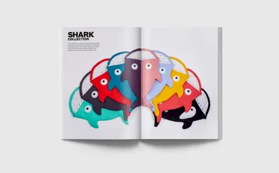
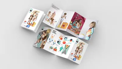
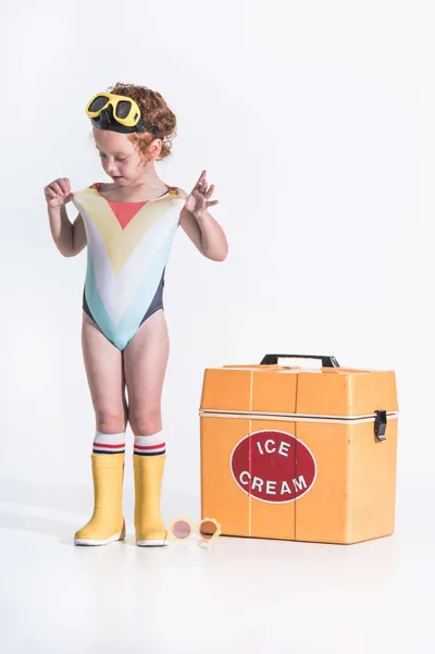
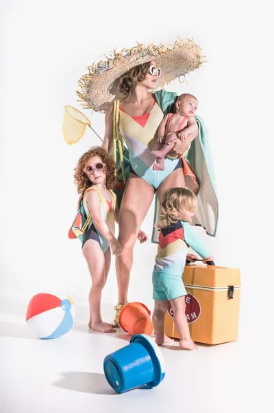
Recognizing that being a parent involves humor, learning, and adaptability, we redefined Babybites’ purpose. The company shifted focus from just babies to parents and the journey of parenting. The narrative emphasized humor in parenting, openhearted creativity, and building memorable family stories.
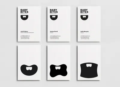
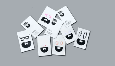
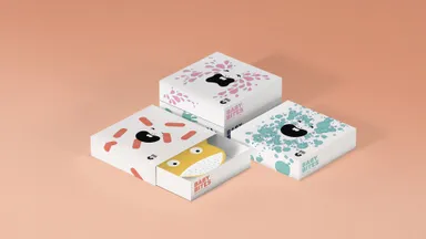
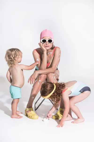
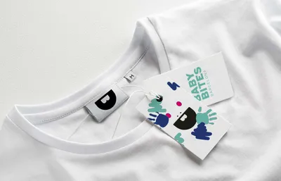
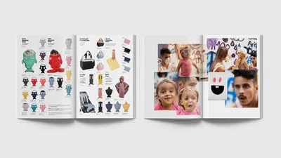
The brand’s Symbol, a playful baby character formed by two front teeth and a big mouthin the shape of the 2 letter “b” in Baby bites. A versatile graphic language was developed to depict various baby-related expressions. Additionally, art-directed photography emphasized the authentic moments of forming families, establishing an intimate connection with the audience and effectively growing the brand’s awareness.
