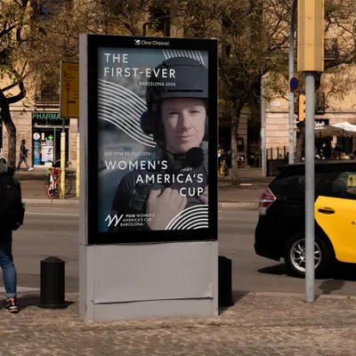
The Puig Women’s America’s Cup is the first race since 1995, that women participate on board, and one of the highlights of this historic sports competition, which celebrates its 37th edition in Barcelona. Puig, the global sponsor of the competition and Naming Partner of the women’s race, together with the organization of the America’s Cup, came to Mucho to design the brand and the visual language of this event that represents a revolution for this sport.
Puig Women’s America’s Cup
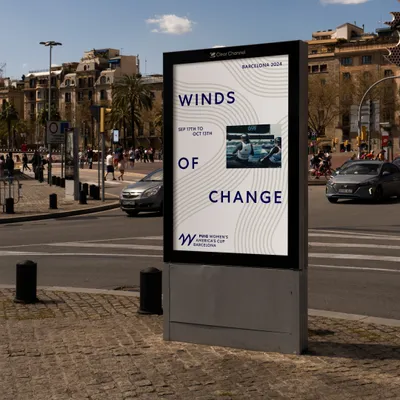
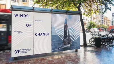
Winds of change
The Puig Women’s America’s Cup is the first women’s race in the history of the America’s Cup. Puig, a global sponsor and Naming Partner, has trusted Mucho to design the Brand and visual language of this revolutionary race.
The challenge
In its 173-year history, women have participated sporadically in the race; The first ever, that women participate on board. So, it is a historic moment to see, for the first time, 12 teams from 12 countries composed entirely of women. For Mucho, the challenge was to create a brand symbol and a visual language to explain and embrace this crucial moment for the sport and for women.
The Strategy
Working in collaboration with the Puig team, the strategy was to create a brand linked to the 37th America’s Cup but with enough personality to give it a distinctive identity. All efforts focused on developing a brand and a visual ecosystem that reflected and unified both the values of the America’s Cup and Puig.
The solution
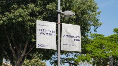
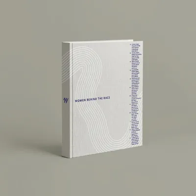
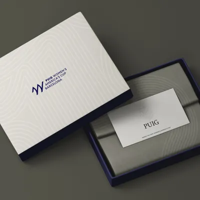
To capture this emblematic moment in the world of sports, the brand required a bold symbol that could be easily recognized and carry a powerful message. The “W” that pays homage to both women and the competitive spirit of sailing. On the other hand, the graphic language allows for a dynamic approach, establishing a connection between the nautical visual universe and the identity of the PUIG brand.
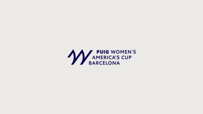
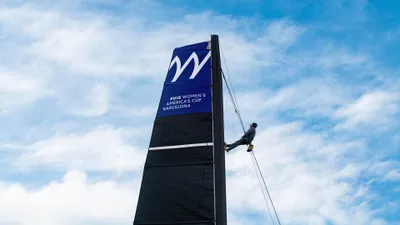
The symbol, inspired by the word ‘Women’, uses the shape of the italicized ‘W’ to represent two competing boat sails. This choice provides a sporty and dynamic design while maintaining simplicity and elegance.
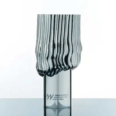
Influenced by the visual elements of the nautical world and Mediterranean aesthetics, the graphic language incorporates flowing lines to capture the essence of sails, water, and wind. Through the interaction between lines, text, and images, the aim is to evoke the typical energy and movement of the competition. These attributes also served as motivation for the architect and designer, Patricia Urquiola, who was responsible for designing the trophy for this edition.
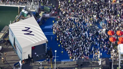
The Puig Women’s America’s Cup will be one of the highlights of the 37th America’s Cup, with 12 teams from various nations.
The six official teams represent New Zealand, Great Britain, Italy, Switzerland, USA and France. And 6 new teams representing the Netherlands, Canada, SPAIN, Germany, Sweden and Australia.
The Puig Women’s America’s Cup marks a groundbreaking moment in the history of this prestigious competition. With Puig as a global sponsor and Naming Partner, they have entrusted Mucho to craft the identity of this revolutionary event. This partnership not only elevates the event’s profile but also sets a new standard in branding excellence.
Let us help your brand make a bold statement and create a lasting impact, get in touch with us to enquire about our branding services.


