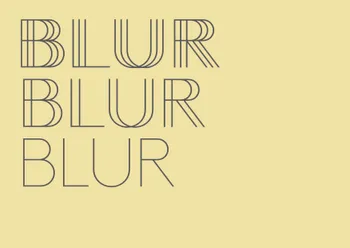
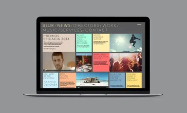
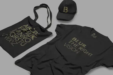
Our solution was a bespoke typeface with three different weights—single, double, and triple. These weights were created by incrementing the number of lines in the font’s basic structure, inducing a blurred effect in line with the company’s name.
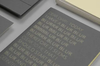
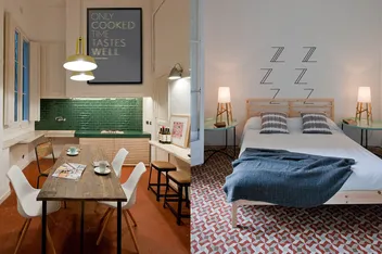
The new identity prioritizes the font, featuring inspirational phrases including the word “blur”. Using the font’s varying weights, we highlighted specific parts of these messages
