Value
Meaning
Future
Designed
Work Architecture_&_Real_Estate
0b Cateb Header

Cateb

Facing a critical transition, Barcelona’s Institute of Technical Architecture, Cateb, sought to rebrand and adapt for the future. 

Partnering with Mucho, they aimed to elevate the prestige of the profession and underscore the essential role of technicality in architecture through a significant brand transformation, all while addressing the obscure nature of the Technical Architect role.

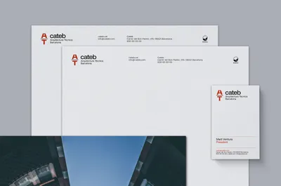
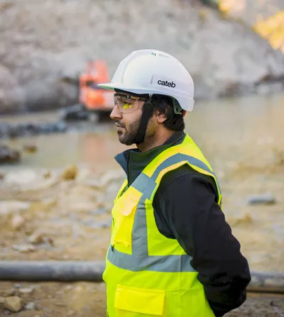
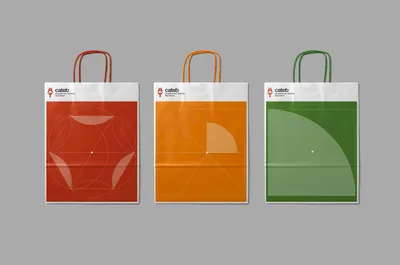
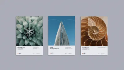
Barcelona’s Institute of Technical Architecture, Cateb, faced a critical turning point. Sociological research indicated the necessity for a brand overhaul to meet future demands, attract younger generations, and elevate its profession’s standing. 

The task was to design a brand that endorsed this shift, supported its purpose, and envisioned a future of increased influence, all while navigating the somewhat obscure role of the Technical Architect.

01a Cateb Logo Before

Enlisting Mucho’s expertise, Cateb focused on a dual-faceted strategy to highlight the profession and underscore architecture’s technical side. The first move was a name transition from ‘CAATEEB’ to the punchier ‘Cateb,’ accompanied by a more precise descriptor—’Barcelona Technical Architecture.’ A new tagline, “To build is to make it possible,” underscored the practitioners’ skills. The second part of the strategy called for a fresh symbol.

03 Cateb Stationery scaled

The new icon, reminiscent of Catalan visual poet Joan Brossa’s work, shows the ‘Technical (T)’ underpinning ‘Architecture (A).’ This visual metaphor conveys the message that architecture relies on technical expertise. A new visual language, organic color palette, and nature-infused photographs enhance the brand narrative. The primary typeface, Aeonik, gives a modern feel, completing the brand’s revitalized identity.

06a Cateb Helmet
06b Cateb Context
11 Cateb Brochure scaled
13 Cateb Redes scaled