Value
Meaning
Future
Designed
Work Sports_&_Gaming

Digilant

Digilant, a preferred media partner for mid-market advertisers, empowers emerging brands and small to mid-sized agencies through their expertise, media, and technology. They entrusted Mucho with designing their new brand identity, presenting an inspiring challenge.

The Challenge

Mucho was tasked with creating a brand symbol and visual language that embodied the bold narrative. The primary challenge was to position digilant as a modern leader among media partners, with a strong ambition to empower every brand’s success through their expertise in media advertising, while conveying of openness and simplicity.

The strategy

In today’s complex media landscape, digilant’s vision is to empower every brand with the opportunity to become the next big thing. Within this context, the company’s daily mission is to support small and medium-sized businesses (SMBs) by simplifying media management and helping them establish the market presence they deserve. The core idea behind the brand is to go further than the status quo and create meaningful impact in the industry, giving everyone the chance to thrive.

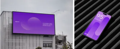
Digilant re brand poster

The solution

To capture the vision of Digilant’s team, the new brand identity needed a bold and dynamic symbol that embodies the empowering impact of their services. The new symbol serves as a visual representation of Digilant’s ability to elevate brands and help them thrive in an ever-evolving media landscape. Alongside this, the visual language was designed to be highly flexible and adaptable, allowing it to seamlessly integrate across different channels and media platforms, ensuring consistency and versatility.

During the workshop sessions, the Mucho team recognised the significance of “connecting the dots the right way” for Digilant’s effectively hit their clients’ targets and transform mavericks into heroes. Using the metaphor of David and Goliath, where David emerges victorious over Goliath with nothing more than a simple stone sling, the aim was to illustrate the precision and expertise required to make a successful shot. The new dynamic logotype visually represents Digilant essence by literally connecting the dots, capturing the motion of “the shot” aimed at hitting a target.

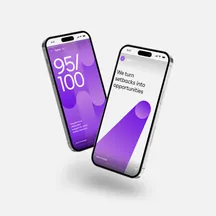
04 Mobile Screen Double

In addition, Mucho has designed a highly adaptable visual identity system to enhance various brand touchpoints within the digital space. “The dot” serves as the centerpiece of motion elements to embody the key aspects of digilant’s manifesto to:

01.  Create your best shot at success by connecting the dots the right way.
02.  Keep our focus on your target.
03.  Act as your guiding light throughout the entire process.
04.  We are the fitting piece to your company, an extension of your team.
05.  We aim for the sweet spot between the present and the future.
06.  Understand the ever-changing media landscape with our expertise.
07.   We believe that every brand deserves a bigger presence.

With the introduction of these dynamic elements, digilant not only reflects the vision of its team but also positions itself to achieve new heights in the digital space.

For the primary brand color, Mucho expanded on the concept of connecting two elements by creating a seamless gradient. This design choice conveys the forceful motion of the shot, resulting in a vibrant and energetic visual identity.

The new icon set enhances accessibility within the visual system by maintaining a balance between radical simplicity and the brand’s essential symbol: the dot. With intuitive motion behavior, users are naturally guided to the dot, effortlessly recognizing its significance while fully grasping the deeper context behind the icon’s meaning.

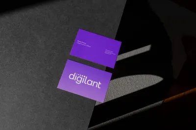
Business Cards
Row 1 1
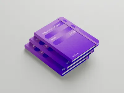
11 Notebook
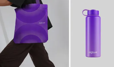
Digilant row

Check out our work page for more branding projects.