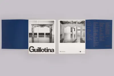
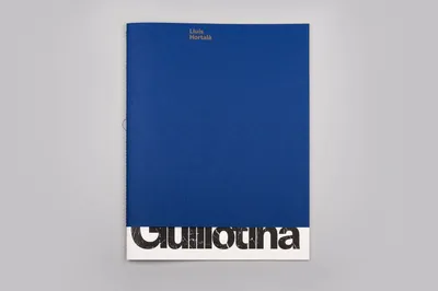
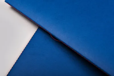
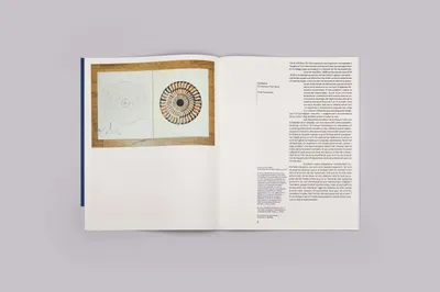
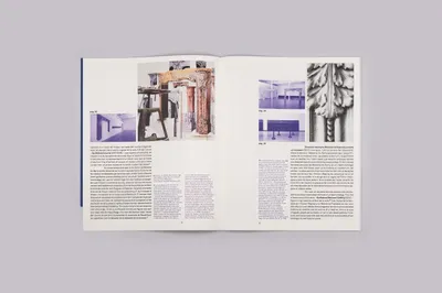
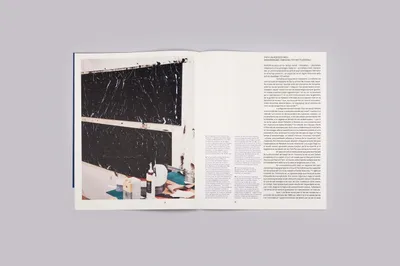
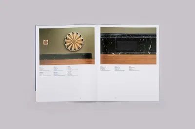
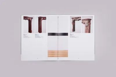
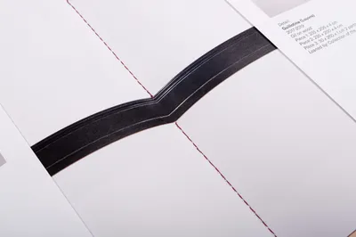
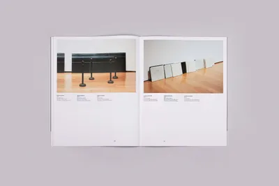
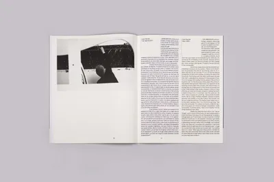
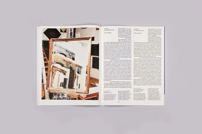
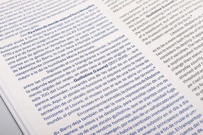
The catalogue’s structure mirrors the artist’s work. It follows a symmetrical layout, positioning photographs centrally, with text and translations anchoring the front and back pages. This layout combines classic and modern binding techniques, akin to Hortalà’s unique art style, facilitating a better understanding of his work within the editorial framework.
Finally, to mimic the grandeur and bold proportions of Hortalà’s works, the catalogue itself is slightly oversized. This aspect further highlights the scale of the artist’s creations, reinforcing the harmonious interplay between his artwork and its representation in the catalogue.
