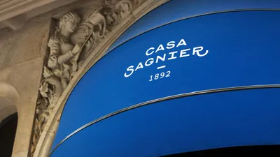
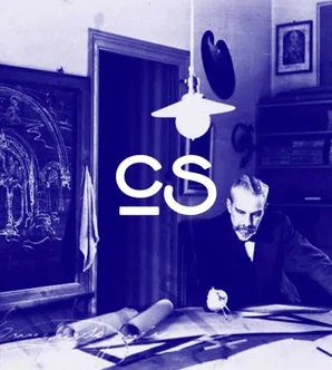
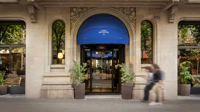
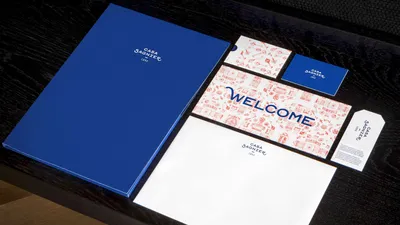
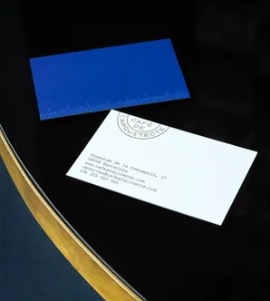
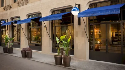
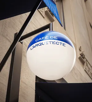
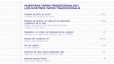
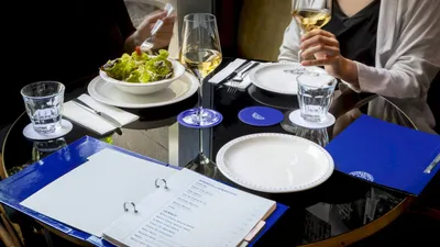
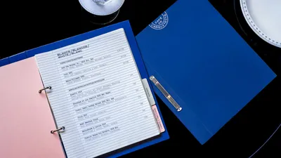
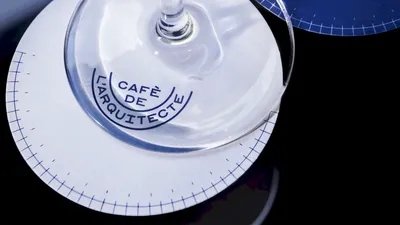
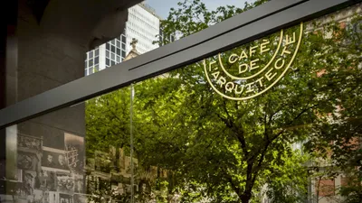
Mucho worked closely with the Casa Sagnier team to craft a rebranding that paid tribute to the rich past of the establishment. In doing so, the focus was on creating a design that encapsulated the unique blend of historic elegance and modern aesthetics.
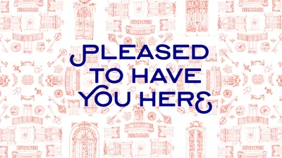
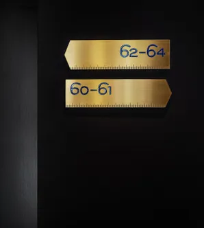
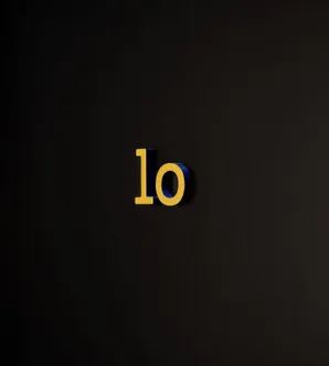
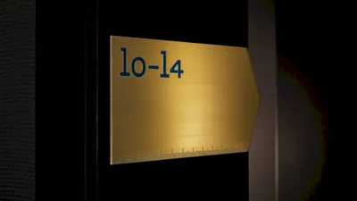
The design involved developing a unique typeface for the hotel that combined two complementary styles - one reflecting the modernism style with small caps and typographic flourishes and the other being more industrial with rounded terminals based on geometric types and typographic reproduction methods in architecture.
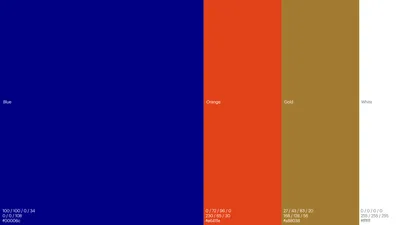
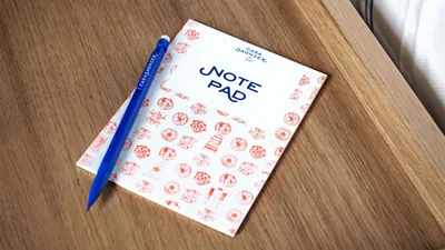
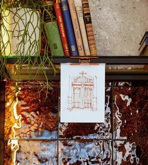
The visual language was defined through a color palette of blue, orange, gold, and white. Blue was chosen to echo the architectural essence, akin to the color of blueprints. Orange was selected to add a contemporary feel in contrast with the blueprint blue, while gold was incorporated to lend an elegant and sophisticated vibe. Sketch-looking illustrations based on Sagnier’s building were used, aligning with the theme of paying homage to the past.
