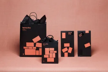
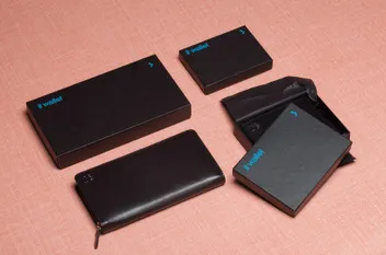
The brand’s unique selling point lies in its broad range of everyday items.
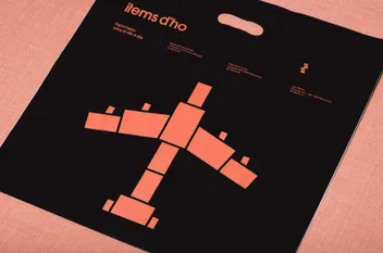
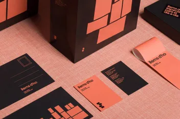
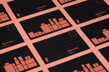
To represent this, four stacked boxes forming the “i” in the brand’s name was devised, creating a versatile graphic language for diverse shapes across various applications.
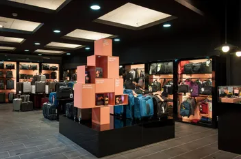
The consistent use of a salmon and black color scheme, applied in both positive and negative, further adds to the brand identity, extending to interiors, window dressings, sales surfaces, and surrounding graphics.
