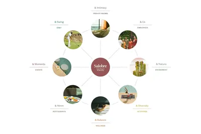
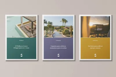
Our strategy was centered around building the core value of serenity into the very fabric of the brand. This meant creating a new approach to naming that allowed for variations according to sector, thereby infusing a more evocative and emotional touch to the brand. This flexible structure would help to highlight the full range of offerings at Salobre. Additionally, we sought to capture the unique experience of a stay at Salobre, which is akin to a personal journey of introspection and self-discovery.

Salobre Hotel Resort & Serenity
Salobre Hotel Resort & Serenity, an exclusive 5-star resort in Gran Canaria, embarked on a journey of transformation. After over a decade as part of Marriott International’s Sheraton Hotel chain, Salobre made a strategic decision to break away and create a distinct hotel concept. The challenge at hand was to encapsulate the essence of Salobre, which is characterized by its unique environment, natural beauty, and dedication to serenity, in a reimagined brand identity.
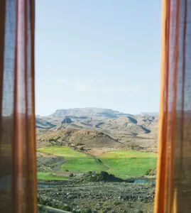
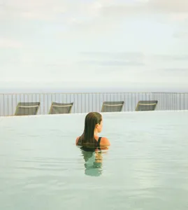
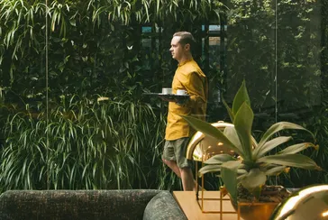
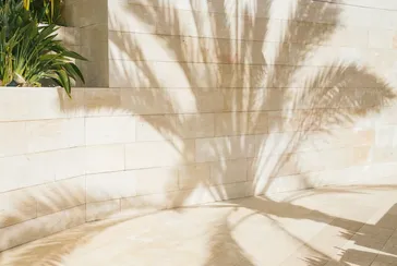
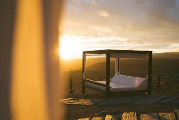
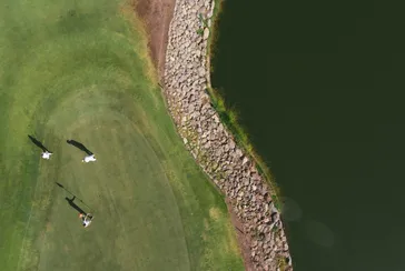
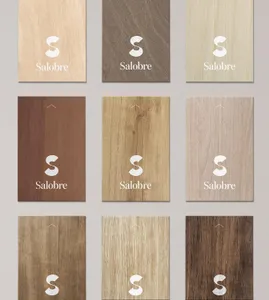
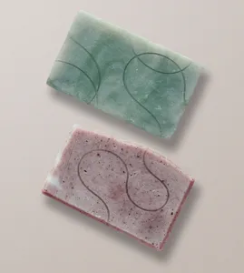
The design solution involved the creation of a dual “S” logo, symbolic of the physical and spiritual path towards serenity. We also formulated a unique brand vocabulary that captures Salobre’s distinct tone of voice and reflects the transformative experience it offers its guests. This can be seen in everything from the dress code to the interaction style of the Salobre team. The art direction for the photography was designed to provoke feelings of serenity, enjoyment, nature, and authenticity, further enhancing the brand’s new identity. In essence, our design solutions strived to bring out Salobre’s uniqueness in each application, ensuring a rich sensory experience that was thoughtful and authentic.
