Antheia is named after the Greek goddess of flowers, which provided much of the inspiration for the identity. The foundation is a custom word mark that was designed to feel more human and distinct than the traditional abstract and anonymous identities found across the biotechnology industry. The elegantly designed serif echoes the tapering of plant stems, while the geometric symbol that anchors the letter A references both a leaf shape and a DNA strand.
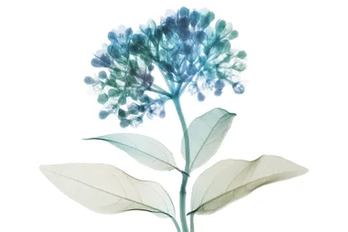
To bring the hidden world of plants to life in a beautiful and unique way, we worked with x-ray images of actual flora by Nick Veasey, the world’s foremost art radiographer.
The color palette was inspired by the multitude of plants from which Antheia synthesizes molecules — from Madagascar Periwinkle to the California Poppy — and the illustration style was developed to communicate complex disease states and conditions with an organic simplicity.


